Checkout & payments
Small security cues next to the payment button ease the anxiety that kills conversions
Trust badges and guarantees near the payment button reassure users at the moment of commitment, reducing hesitation and cart abandonment.
Checkout & payments
Small security cues next to the payment button ease the anxiety that kills conversions
Trust badges and guarantees near the payment button reassure users at the moment of commitment, reducing hesitation and cart abandonment.
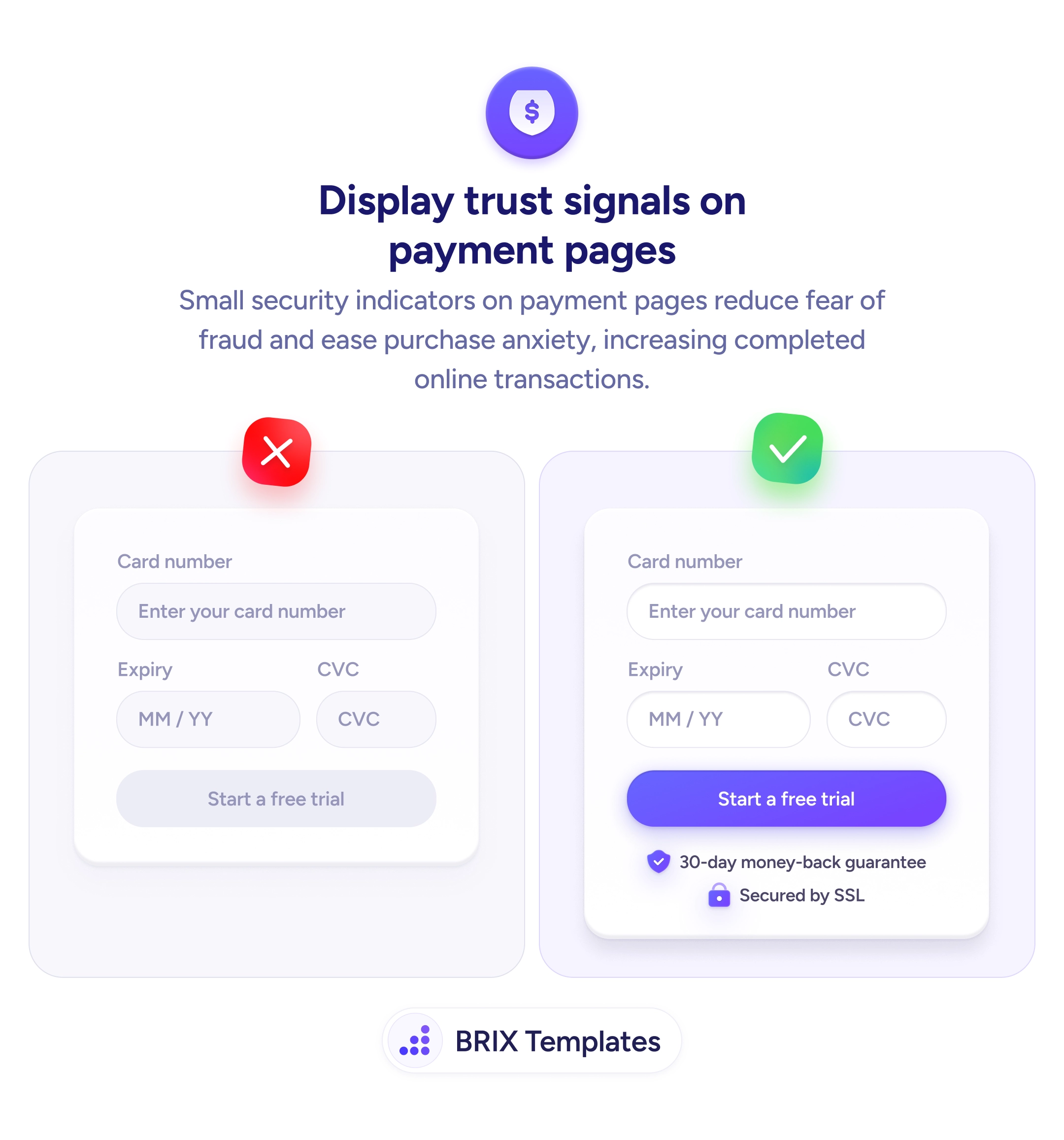
The moment a user reaches the payment form, anxiety spikes. They’re about to hand over card details, and a bare payment form with no security indicators does nothing to ease that concern. Without visible reassurance, even motivated buyers can hesitate, second-guess, or abandon the transaction entirely.
A stronger approach is to place recognizable trust signals directly beneath the payment button. Security badges like an SSL lock icon, a money-back guarantee with a shield, or familiar payment provider logos give users quick visual proof that the transaction is protected. These cues work because they appear at the point of commitment — the exact moment when doubt is highest and reassurance matters most.
Choose trust signals that are specific and verifiable rather than generic. A “30-day money-back guarantee” is more convincing than a vague “100% secure” label because it names a concrete policy. Keep them compact and positioned close to the CTA so they’re seen in the same glance as the button, not buried further down the page. Avoid cluttering the area with too many badges — two or three well-chosen signals typically outperform a wall of logos.
This kind of contextual reassurance can reduce the gap between intent and action. When users see that their transaction is backed by recognizable protections, the payment step often feels less like a risk and more like a routine confirmation.
Place trust signals directly below the payment or submit button, within the same visual group. This ensures users see security reassurance at the exact moment they decide whether to complete the transaction.
SSL lock icons, money-back guarantee badges, and recognized payment provider logos tend to be most effective because users already associate them with security. Choose badges that reflect actual policies or certifications your site supports.
Two or three well-chosen badges are typically enough. Showing too many can create visual clutter and dilute the reassurance effect, making the area feel cluttered rather than trustworthy.
A combination works best. Icons like shields and locks communicate security at a glance, while short text labels (e.g., '30-day money-back guarantee') add specificity that icons alone cannot convey.