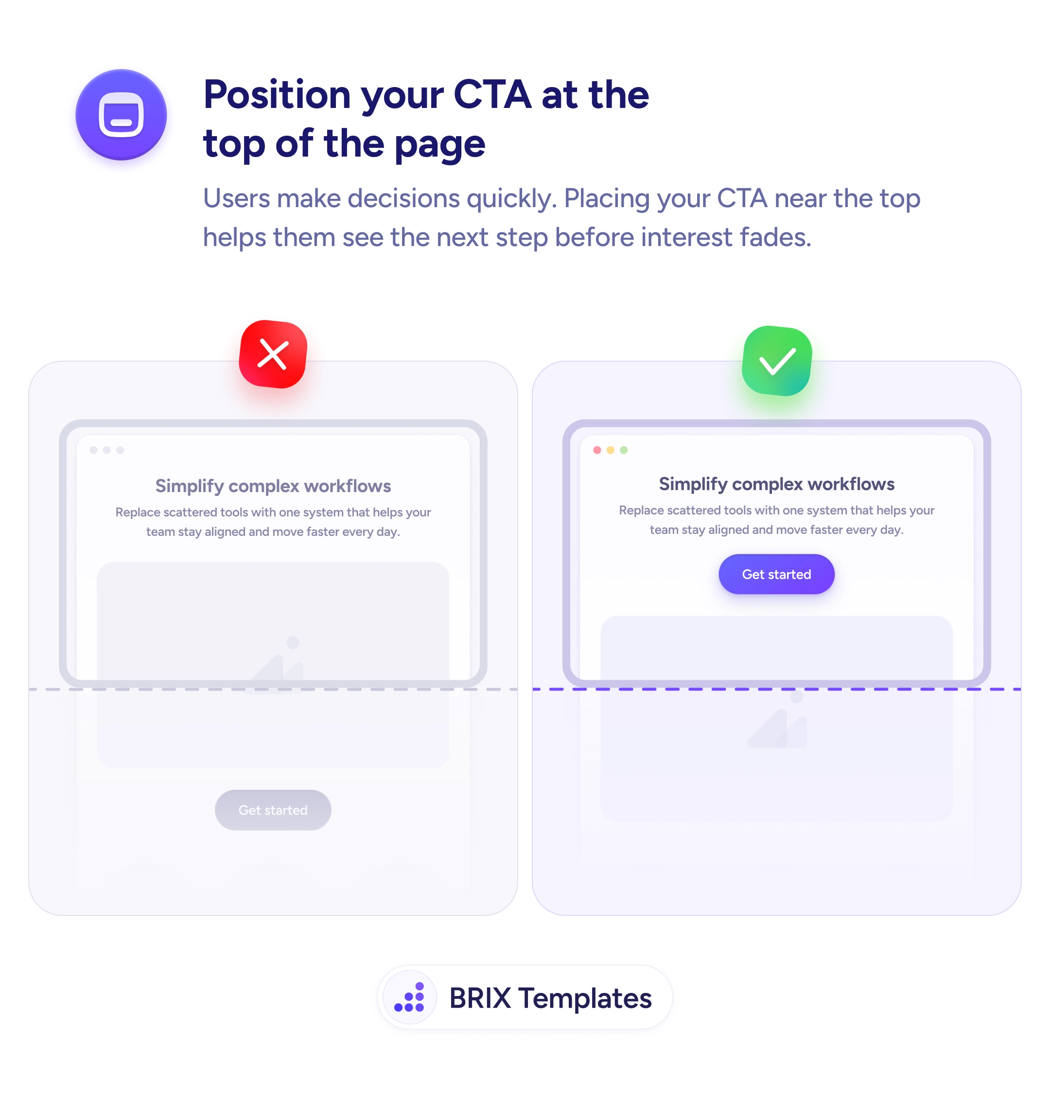


Actions & CTAs
The closer your social proof is to the button, the harder it is to ignore
Social proof placed far from the CTA gets missed when it matters. Put a compact trust element next to the button to boost confidence at the click point.
Actions & CTAs
The closer your social proof is to the button, the harder it is to ignore
Social proof placed far from the CTA gets missed when it matters. Put a compact trust element next to the button to boost confidence at the click point.
When a call-to-action button sits alone on the page, users who are almost ready to commit often hesitate. They wonder whether the product is trustworthy, whether others have had a good experience, or whether the offer is worth it. That moment of doubt is enough to stall the click — and once a user scrolls away, they may never come back.
A simple fix is to place social proof directly next to the CTA. A compact testimonial snippet, an avatar stack with a customer count, or a short star rating positioned right beside the button gives users the reassurance they need at the exact moment they need it. The proximity matters: trust signals that live in a separate section of the page often go unnoticed when the decision is actually happening.
When implementing this, keep the social proof element compact and scannable. A single line like “Trusted by 5,000+ customers” with a few avatar thumbnails is often enough. Avoid long testimonial blocks that push the CTA further down or create visual clutter. The goal is to reinforce confidence, not to overwhelm the area around the button. Test different formats — a customer count, a short quote, or a rating — to see which resonates with your audience.
This kind of proximity-based social proof can reduce the gap between interest and action. Users who see that others have already committed often feel more confident doing the same — right when it matters most.
Trust signals in a separate page section are often missed at the moment of decision. Placing proof next to the button means users see reassurance exactly when doubt is highest — right before they click.
It's most effective on landing pages, pricing sections, and signup forms — anywhere hesitation is highest. On informational or documentation pages where the CTA is secondary, the impact is smaller.
Vary it when possible. A customer count on the hero CTA, a short quote on the pricing CTA, and a star rating on the footer CTA feel intentional rather than repetitive.
Not if it's real. Use genuine customer counts, authentic quotes, and verified ratings. Fabricated social proof undermines trust faster than no proof at all.