UX tip graphic with the title 'Avoid intrusive popups that interrupt the mobile experience.' Two mobile screens side by side: the left screen marked with a red X shows a large blocking popup covering the page content with a 'Subscribe to our newsletter' form, the right screen marked with a green checkmark shows a small dismissible banner at the bottom reading 'Subscribe for updates' with a link to the newsletter. BRIX Templates branding at the bottom.

Help & onboarding

If your first interaction with a mobile user is blocking their view, you've already lost

Blocking popups on mobile disrupt the user's flow and often get dismissed without reading. Smaller inline prompts convert better by respecting the experience.

Why mobile popups hurt engagement and conversions

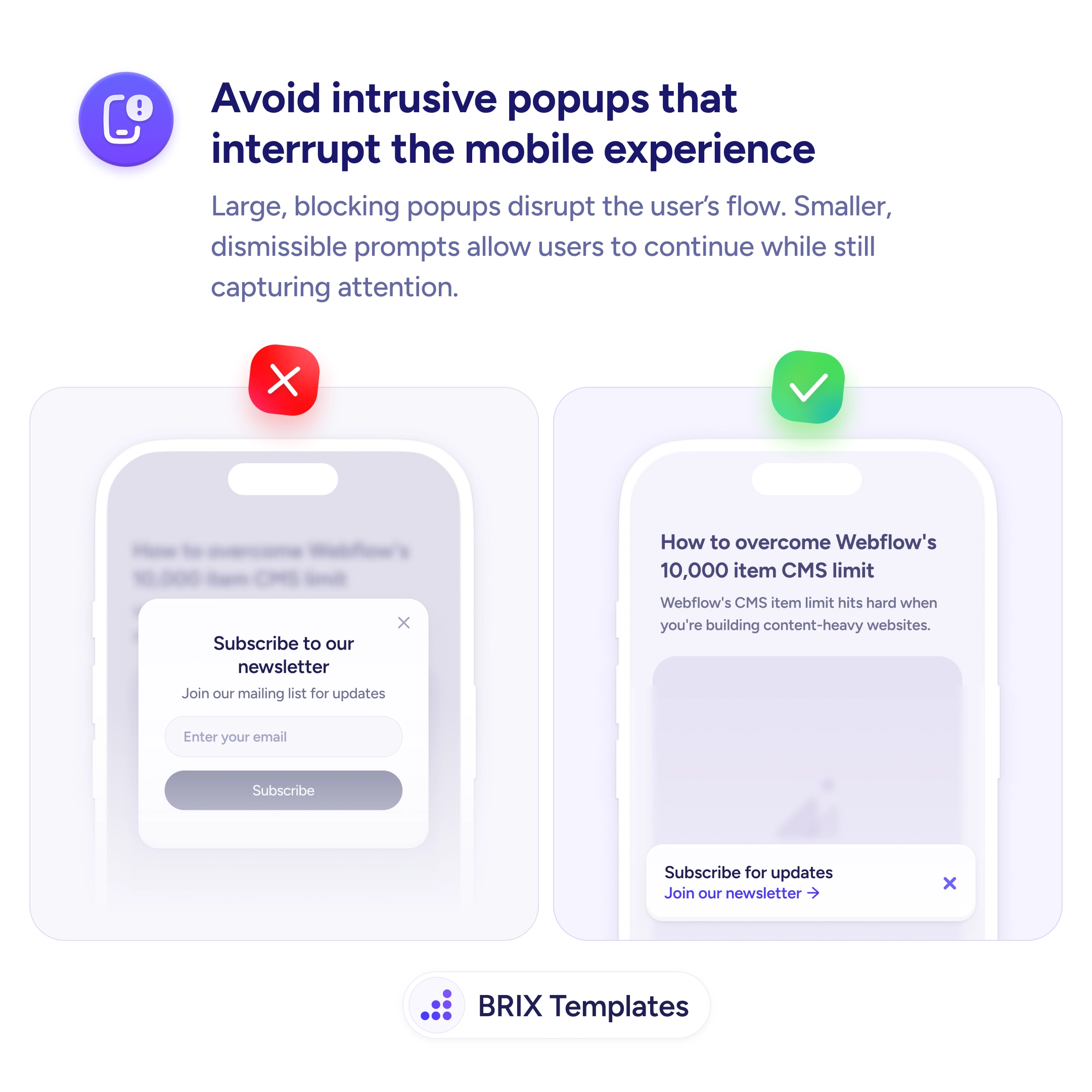
When a full-screen popup takes over a mobile viewport, users lose all context of the page they were reading. The content disappears, replaced by a prompt they didn’t ask for — and the instinctive reaction is to close it as fast as possible. Most users dismiss intrusive interstitials before processing the message, which means even a genuinely good offer gets reflexively swiped away.

A better approach is to use smaller, non-blocking prompts that stay anchored to the bottom of the screen. A compact dismissible banner can capture just as much attention without hijacking the experience. The user keeps reading, the prompt stays visible, and the interaction feels like an invitation rather than an interruption.

Time the prompt for engagement, not for arrival. Showing it immediately on page load is the most common mistake. Wait until the user has scrolled past the first viewport or spent at least a few seconds reading. Keep the banner to no more than 20-30% of the viewport height so page content remains visible behind it. Include a clear, tappable close button — prompts without one feel like traps.

  • Replace full-screen popups with compact bottom banners that don’t block the content.
  • Delay the prompt until the user has shown engagement — scroll depth or time on page.
  • Keep the banner small so the page content stays visible behind the prompt.
  • Add a clear dismiss action with a close button that meets minimum touch target size (44×44px).
  • Suppress the prompt for users who have already dismissed or converted — don’t ask twice.

This kind of non-intrusive prompt can preserve the user’s flow while still capturing leads. Users who aren’t interrupted often engage more willingly, which typically results in better quality interactions than those forced by a blocking overlay.

Frequently asked questions

Should I remove all popups on mobile or just make them smaller?

Make them smaller and non-blocking. The goal isn't to eliminate prompts — it's to prevent them from hijacking the screen. A well-timed compact prompt can still capture leads without disrupting the experience.

How do I handle popups on mobile for returning vs new visitors?

Show prompts only to users who haven't already dismissed or converted. Use a cookie or local storage flag to suppress the prompt for returning visitors who already engaged with it.

What's the ideal size for a mobile prompt?

No more than 20-30% of the viewport height. This keeps the page content visible behind the prompt, so users don't feel like they've lost their place. Anchor it to the bottom of the screen for easy thumb dismissal.

Should I show a popup after exit intent on mobile?

Exit intent is unreliable on mobile since there's no cursor to track. Instead, trigger prompts based on scroll depth or time on page — signals that indicate genuine engagement rather than guessing when someone is leaving.