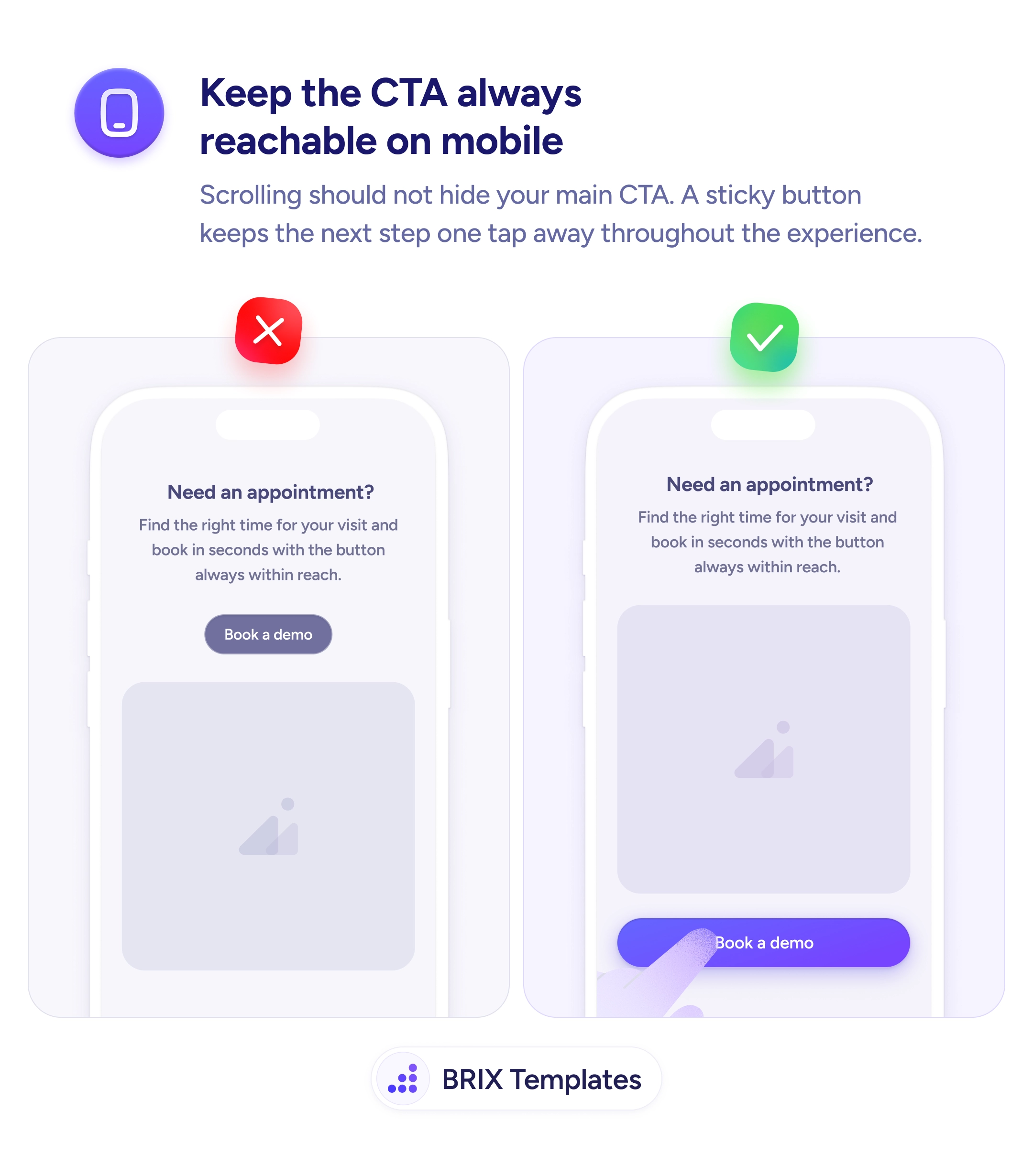
Navigation
Navigation your thumb can't reach is navigation that slows every interaction
Navigation at the top of a mobile screen is hard to reach one-handed. Move key actions to the bottom bar where thumbs can reach them easily.
Navigation
Navigation your thumb can't reach is navigation that slows every interaction
Navigation at the top of a mobile screen is hard to reach one-handed. Move key actions to the bottom bar where thumbs can reach them easily.
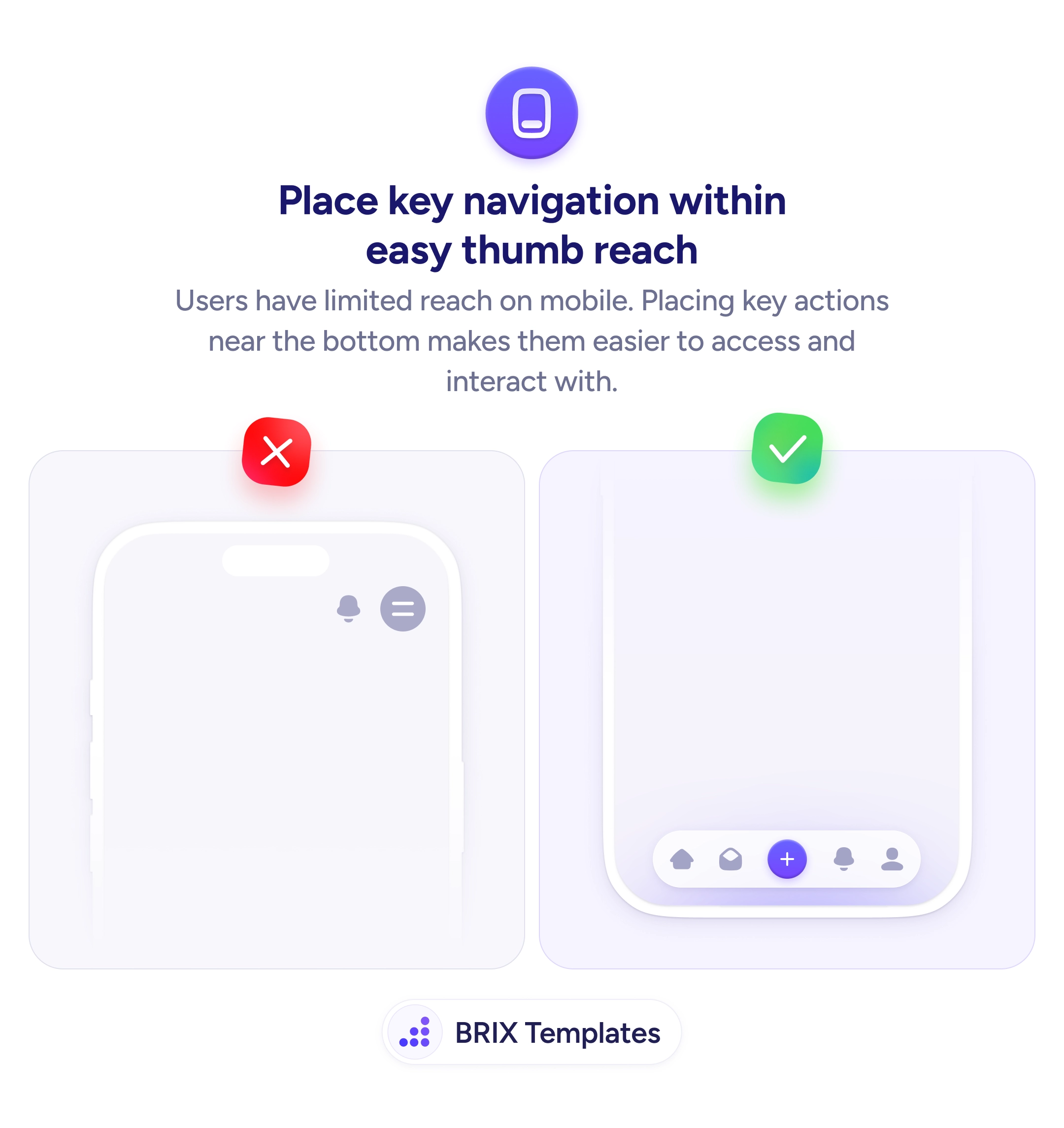
When key navigation elements sit at the top of a mobile screen, users have to stretch their thumb or shift their grip to reach them. On larger phones — which are now the majority — the top 30-40% of the screen is effectively a hard-to-reach zone during one-handed use. Placing primary navigation there adds physical friction to every interaction.
A more ergonomic approach is to move key navigation actions to the bottom of the screen where the thumb naturally rests. A bottom navigation bar with the most-used actions — home, search, create, notifications, profile — keeps everything within easy reach. The top of the screen can still hold contextual information like page titles or search bars that are used less frequently.
Identify which actions users perform most often, then place those in the bottom navigation bar. Keep the bar to 4-5 items — more than that crowds the space and shrinks touch targets. Give each icon a text label so the action is clear even without memorizing icon meanings. Reserve the top bar for secondary actions, back navigation, or contextual headers.
Bottom navigation can make mobile interfaces feel faster and more natural to use. Users who don’t have to stretch or adjust their grip for common actions typically move through the app with less effort and more confidence.
Most users hold their phone in one hand with their thumb as the primary input. The thumb's natural arc reaches the bottom and center of the screen easily but requires stretching or grip adjustment to reach the top — especially on phones over 6 inches.
It works best for apps with 3-5 top-level sections that users switch between frequently. Content-heavy apps (news readers, documentation) may benefit more from a hamburger menu with bottom-placed key actions.
Gestures can complement bottom navigation but shouldn't replace it. Not all users discover gesture-based navigation, so visible controls should always be available as the primary interaction method.
Larger phones make top-placed navigation even harder to reach. Since phone screens have been growing for years, designing for thumb reach at the bottom is increasingly important — what worked on 4-inch screens doesn't work on 6.7-inch screens.