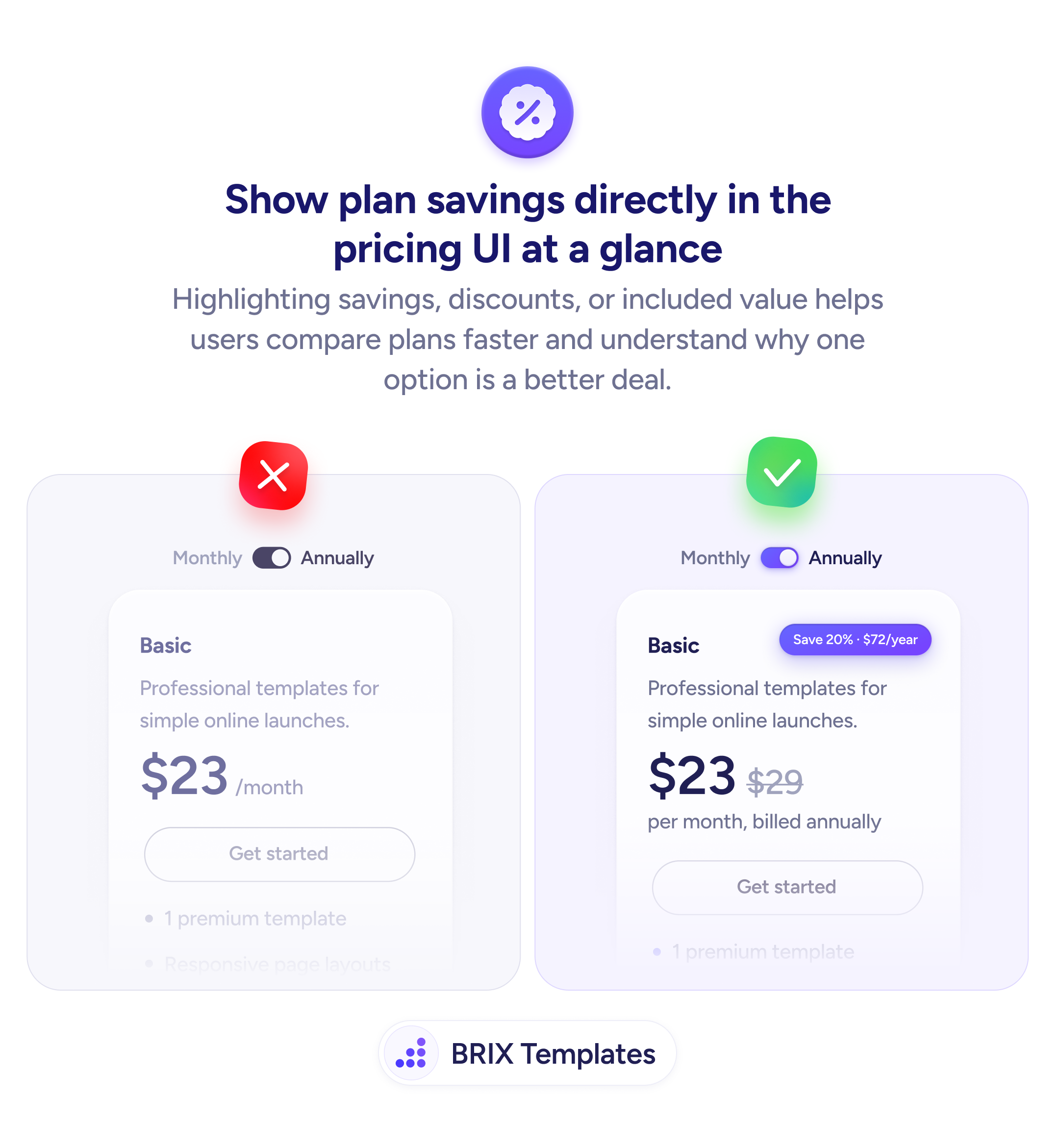
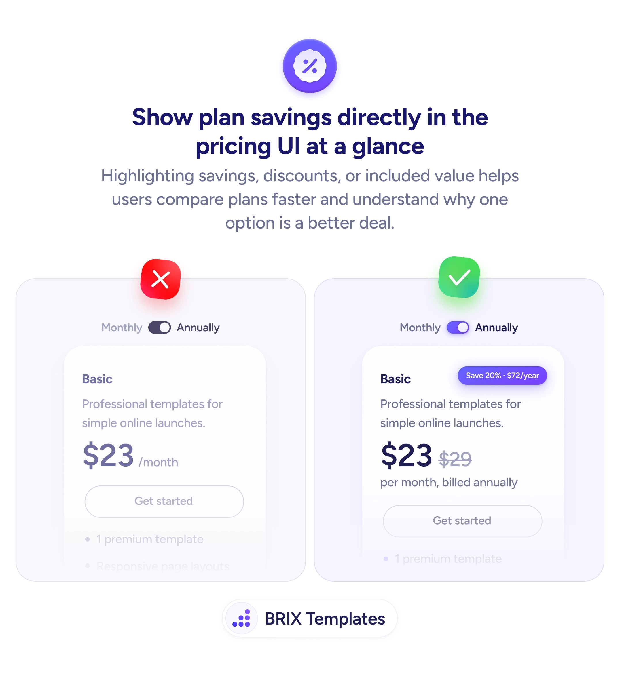
When a pricing card shows a bare number — “$23/month” with an annual toggle — users have no immediate sense of what they’re saving by choosing the longer commitment. The discount exists, but the value isn’t visible. Users who have to calculate the savings themselves rarely do — they either pick the monthly plan or leave the page undecided.
A stronger approach is to show the savings directly in the pricing UI. Display the original price with a strikethrough next to the discounted price, add a savings badge (“Save 20% · $72/year”), and include the billing frequency (“per month, billed annually”) so users understand exactly what they’re paying and what they’re getting. Every element should be visible at a glance, not hidden behind a toggle.
Place the savings badge near the price so it’s seen in the same visual scan. Show the crossed-out original price next to the new one to anchor the comparison. State the billing terms clearly — “per month, billed annually” is more transparent than just “$23/month” with a toggled annual switch. Use color or weight on the savings badge to draw attention without overwhelming the card.
- Add a savings badge (e.g., “Save 20% · $72/year”) next to the plan price to highlight the discount.
- Show the original price with a strikethrough to anchor the perceived value of the deal.
- State the billing frequency clearly — “per month, billed annually” removes ambiguity about what the user is committing to.
- Position savings information inline with the price so users see it at a glance, not after clicking a toggle.
- Use visual emphasis on the savings badge — color, weight, or a tag style — to make it attention-catching without cluttering the card.
Making plan savings visible can shift the user’s framing from “how much does this cost?” to “how much am I saving?” That reframe often increases the rate at which users choose annual plans, because the value is obvious rather than hidden.