Checkout & payments
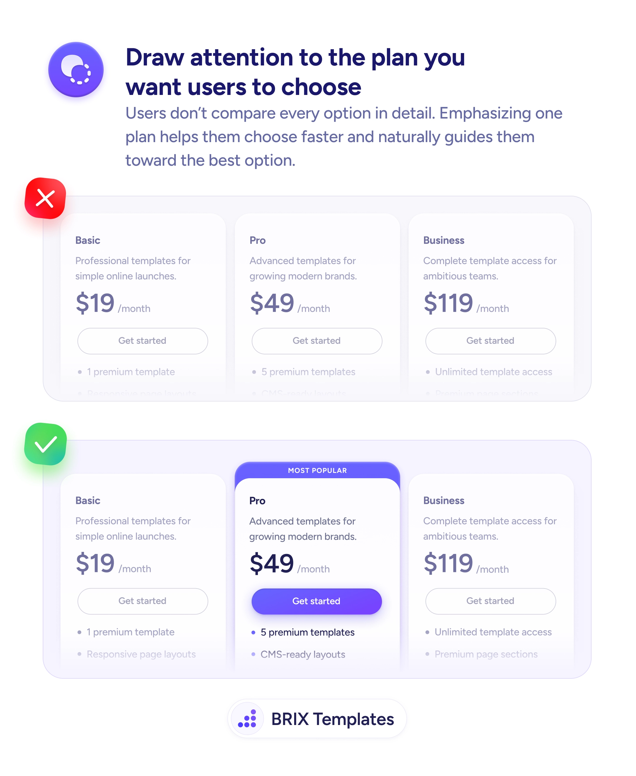
Equal-weight pricing cards turn a simple choice into an exhausting comparison
When all pricing plans look the same, users stall. Draw attention to the recommended option with visual emphasis to reduce comparison time.
Checkout & payments
Equal-weight pricing cards turn a simple choice into an exhausting comparison
When all pricing plans look the same, users stall. Draw attention to the recommended option with visual emphasis to reduce comparison time.
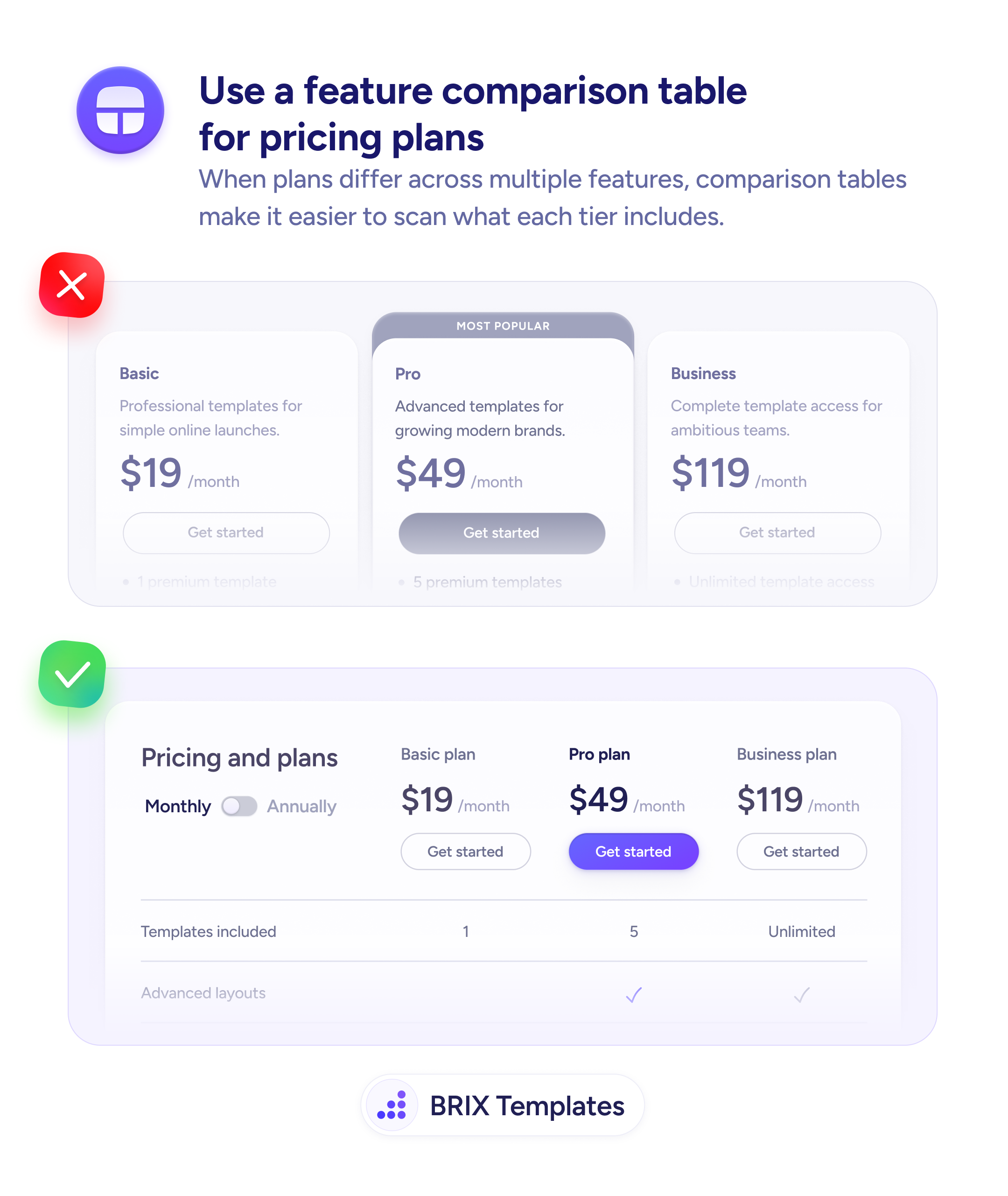
When every pricing card on a page looks the same — identical sizing, identical button styles, identical visual weight — users are forced to compare every detail across every plan before making a decision. This kind of equal-weight pricing layout turns a simple choice into an exhausting analysis. Many users stall, second-guess, or leave the page entirely rather than work through the comparison.
A stronger approach is to visually emphasize the plan you want most users to choose. Add a “Most Popular” badge, increase the card’s visual size or elevation, and give its CTA button the highest-contrast treatment on the page. The other plans stay available and clearly priced, but the recommended option is unmistakably the focal point.
Decide which plan serves the majority of your users, then design the page to guide attention toward it. Use size, color, and labeling to create a clear visual hierarchy across the pricing tier. Keep secondary plans visually quieter — outline buttons, smaller type, or a recessed card style — so the recommended plan’s CTA is the most obvious click target on the page.
This kind of guided pricing layout can help users make decisions faster and with more confidence. When one plan stands out clearly, users often treat it as the starting point for their evaluation — which typically reduces comparison paralysis and increases conversions.
When all plans look equal, users feel compelled to analyze every detail before choosing. A highlighted plan provides a starting point — users can evaluate it first and only compare alternatives if it doesn't fit, which reduces cognitive load.
Yes. The highlighted plan acts as an anchor — users evaluate other plans relative to it. If the recommended plan is well-positioned in terms of price and features, users are more likely to choose it or the tier immediately above or below.
Not if it's genuinely the best fit for most users. A 'Most Popular' label backed by real usage data is helpful guidance. Highlighting the most expensive plan without justification can feel pushy and erode trust.
Only if it's genuinely the most popular or best value for the majority. Highlighting the highest tier when most users need the middle option looks like upselling, which can reduce trust rather than guide decisions.