Checkout & payments
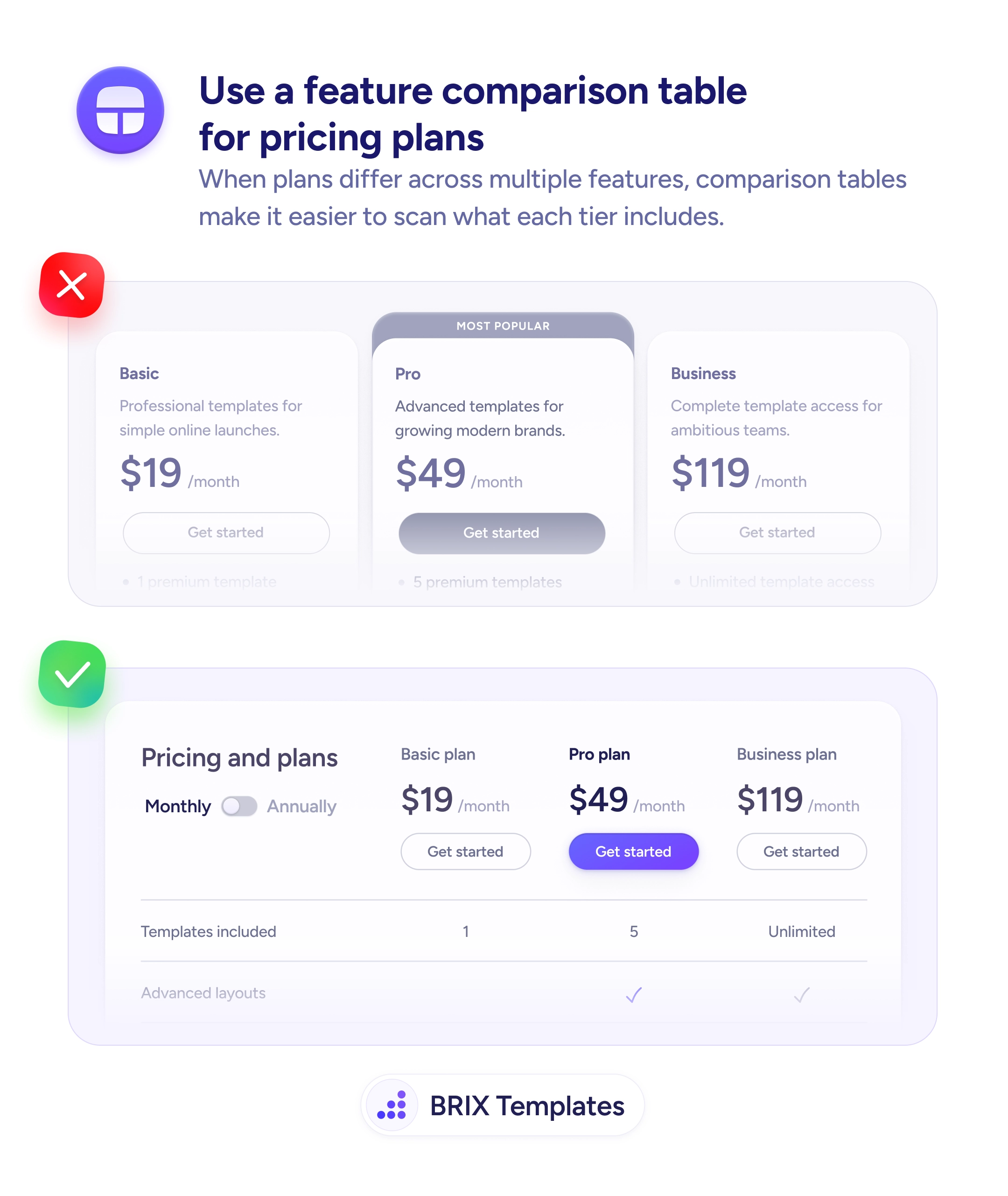
Pricing cards that hide half the features make every plan look the same
When plans differ across multiple features, card layouts force users to scroll and remember. Comparison tables make differences scannable at a glance.
Checkout & payments
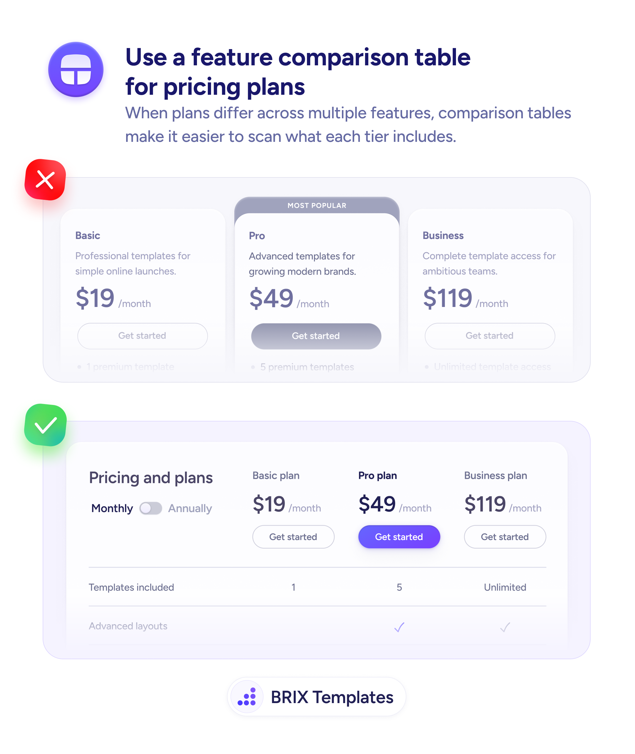
Pricing cards that hide half the features make every plan look the same
When plans differ across multiple features, card layouts force users to scroll and remember. Comparison tables make differences scannable at a glance.
When pricing plans are displayed as stacked cards with truncated feature lists, users can’t easily compare what each tier includes. They have to scroll between cards, remember which features appeared where, and mentally reconstruct the differences. This cognitive load can stall the purchase decision — especially when the plans differ across many features.
A more effective format is a feature comparison table where plans form the columns and features form the rows. Users can scan left to right on any row to see exactly which plans include that feature, with checkmarks or values making the answer instantly clear. The table structure turns a memory exercise into a visual scan.
List features as rows and plans as columns so each row answers one comparison question. Keep the recommended plan’s column visually distinct — bolder header, highlighted background, or a “Most Popular” label. Pin the plan headers and CTA buttons so they stay visible as users scroll through features. Include pricing and CTAs in the table itself so users don’t have to scroll back up to act.
Comparison tables can make complex pricing structures feel simple and transparent. When users can see every plan’s inclusions at a glance, they typically make faster decisions with more confidence — because the answer to “what do I get?” is always one scan away.
A table can still work — two columns with clear feature comparisons are easy to scan. But with only two plans and a few feature differences, side-by-side cards may be simpler and sufficient.
Show base features in the main table and list add-ons in a separate section below. Mixing base features and optional add-ons in the same table creates confusion about what's included by default.
Place FAQs below the table, not inside it. Common pricing questions like billing, refunds, and upgrades complement the feature comparison but belong in their own section for clarity.
They can, but you may need to show usage limits as row values ('100 API calls/day' vs '10,000/day') instead of checkmarks. If pricing depends entirely on usage, a calculator or slider may be more effective than a static table.