
Forms & inputs
Catch errors as they happen, not after the user thinks they're done
Generic post-submit errors leave users guessing what went wrong. Inline validation checks each field on blur and shows specific fixes instantly.
Forms & inputs
Catch errors as they happen, not after the user thinks they're done
Generic post-submit errors leave users guessing what went wrong. Inline validation checks each field on blur and shows specific fixes instantly.
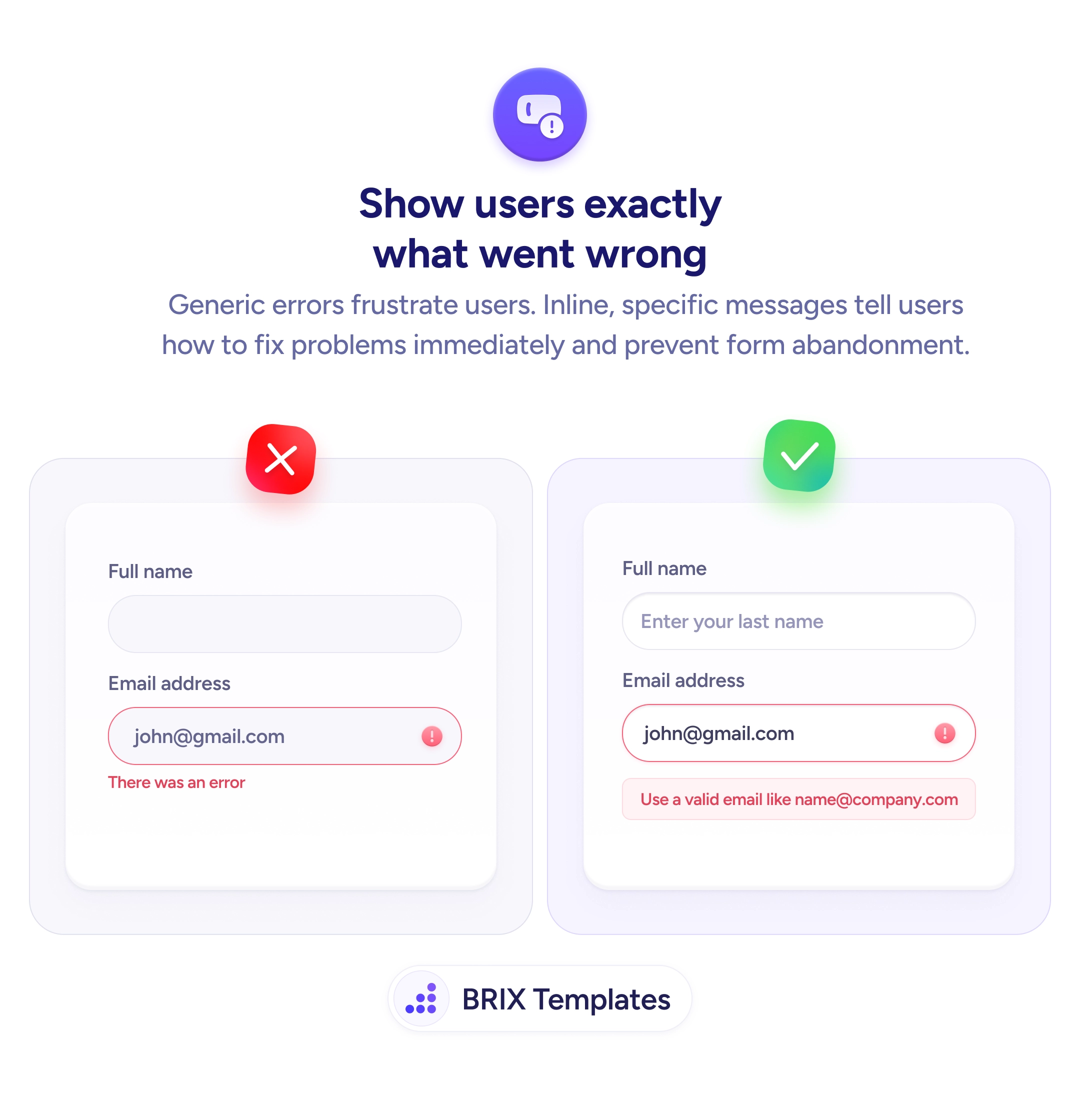
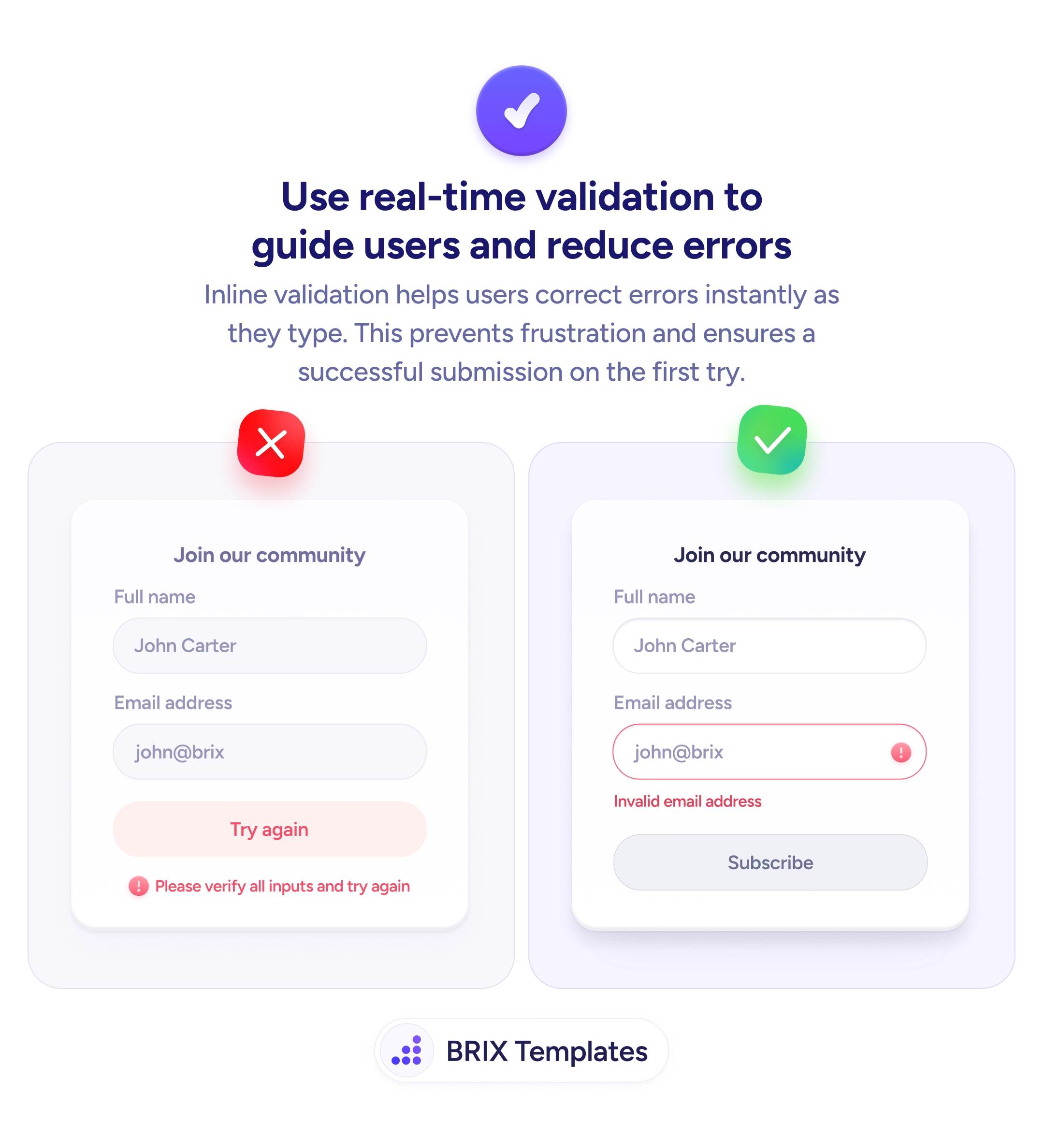
When a form waits until submission to flag problems, users get hit with a vague message like “Please verify all inputs and try again.” They now have to re-scan every field, guess which one is wrong, and fix it blindly. This kind of post-submit validation often leads to repeated failed attempts, rising frustration, and higher abandonment — especially on longer forms.
A better approach is to validate each field in real time as the user fills it out. Inline validation checks the input the moment a user leaves a field (or as they type) and displays a specific error message directly next to the problem. Instead of one generic wall of errors at the bottom, the user sees exactly what needs fixing, exactly where it needs fixing.
To implement this well, trigger validation on blur (when the user moves to the next field) rather than on every keystroke — validating mid-typing can feel aggressive and distracting. Show the error message immediately below the field with a clear visual cue like a colored border or icon. The message itself should be specific: “Invalid email address” is actionable, while “This field has an error” is not. Clear the error automatically once the user corrects the input, so they get instant confirmation that the fix worked.
This pattern of real-time inline validation can make forms feel more guided and forgiving. Users typically correct errors on the first attempt when they get immediate, specific feedback — which often means fewer failed submissions and a smoother path to completion.
On blur — when the user moves to the next field. Validating on every keystroke feels aggressive and can display errors before the user has finished typing, which creates unnecessary frustration.
Directly below the specific field that has the problem, with a clear visual cue like a colored border or icon. Never in a banner at the top of the page or in a generic summary at the bottom.
It should name what's wrong and how to fix it. 'Invalid email address' is clear. 'This field has an error' is not. Include a correct-format example when the format is the likely issue.
Yes. Removing the error state immediately when the input is corrected gives users instant positive feedback that the fix worked, keeping them moving forward confidently.