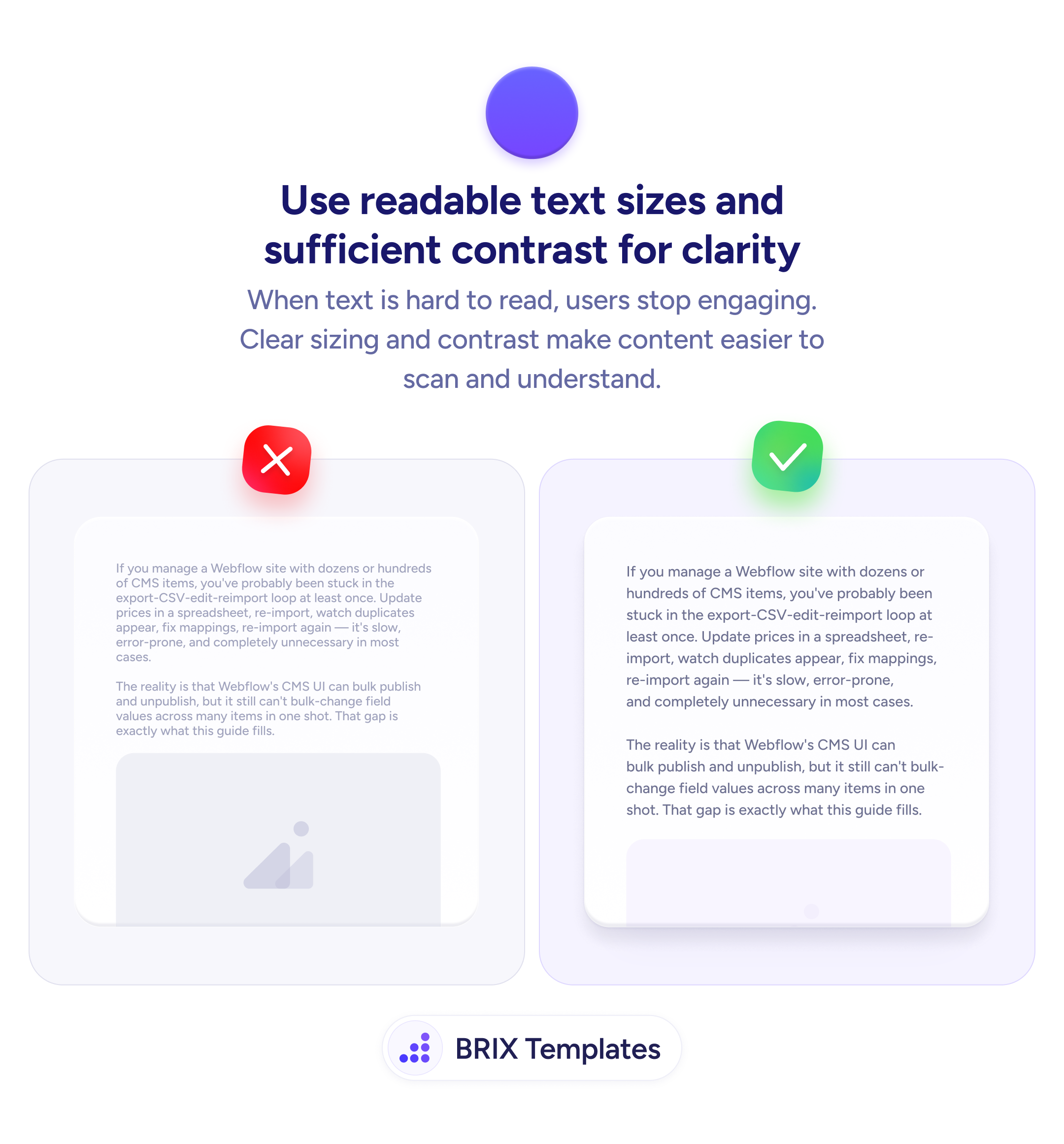
Readability
Text that's hard to read is text that won't be read
Small text and low contrast make users stop reading. Use clear sizing and sufficient contrast so content is easy to scan and understand.
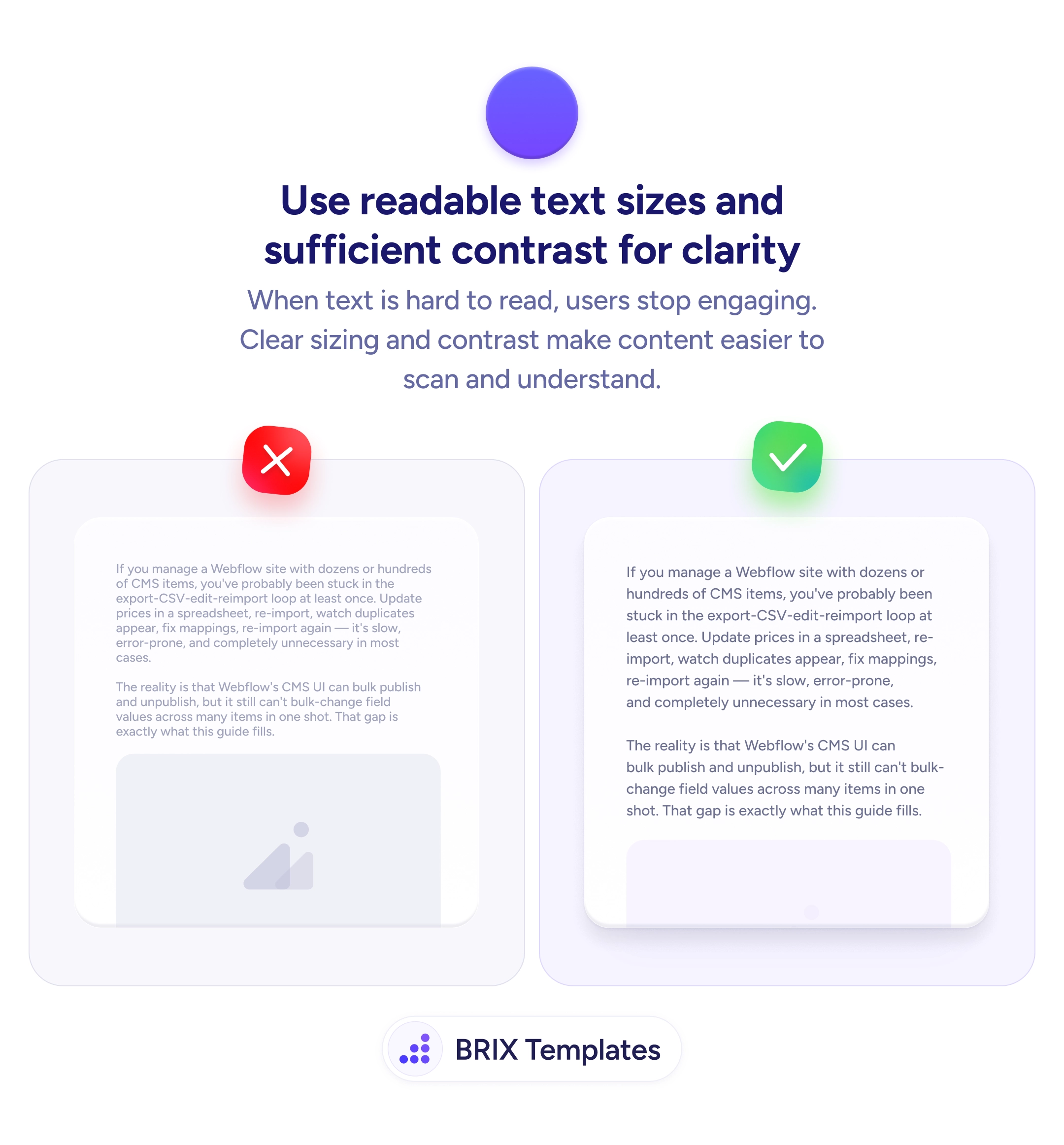
Readability
Text that's hard to read is text that won't be read
Small text and low contrast make users stop reading. Use clear sizing and sufficient contrast so content is easy to scan and understand.
When body text is too small or uses low contrast against its background, users stop engaging with the content. They may skim the headings, scroll past the paragraphs, or leave the page entirely. A wall of small, light-gray text on white doesn’t just look hard to read — it signals that the content isn’t worth the effort.
The fix is to use text sizes and contrast ratios that make reading effortless. Body text should be large enough to read without zooming — typically 16px minimum on mobile, 18px+ on desktop. Color contrast between text and background should meet at least the WCAG AA standard (4.5:1 for body text), which ensures legibility across different screens, lighting conditions, and visual abilities.
Audit your body text on a real device — what looks fine on a design tool at 200% zoom may be unreadable at actual size. Increase line height (1.5–1.75× the font size) so lines don’t feel cramped. Avoid light gray text on white backgrounds — the aesthetic may feel “clean” but the readability cost is real. Test in bright sunlight if your audience uses mobile outdoors.
Readable text is the baseline for everything else on a page. Users who can scan and absorb content effortlessly are more likely to engage with the offer, trust the product, and take action — because they actually read what you wrote.
16px is the practical minimum for mobile screens — anything smaller requires pinch-zooming on most devices. On desktop, 18px or larger is recommended for comfortable reading without leaning into the screen.
At least 4.5:1 against the background color, which is the WCAG AA standard for normal text. For large text (18px+ bold or 24px+ regular), the minimum is 3:1. Use a contrast checker tool to verify.
1.5 to 1.75 times the font size is the recommended range. A 16px font should have at least 24px line height. Too tight and lines blur together; too loose and text feels disconnected.
Use a tool like WebAIM's Contrast Checker, Chrome DevTools' accessibility panel, or the Stark plugin for Figma. Enter your text color and background color to see the ratio and whether it meets WCAG AA or AAA standards.