
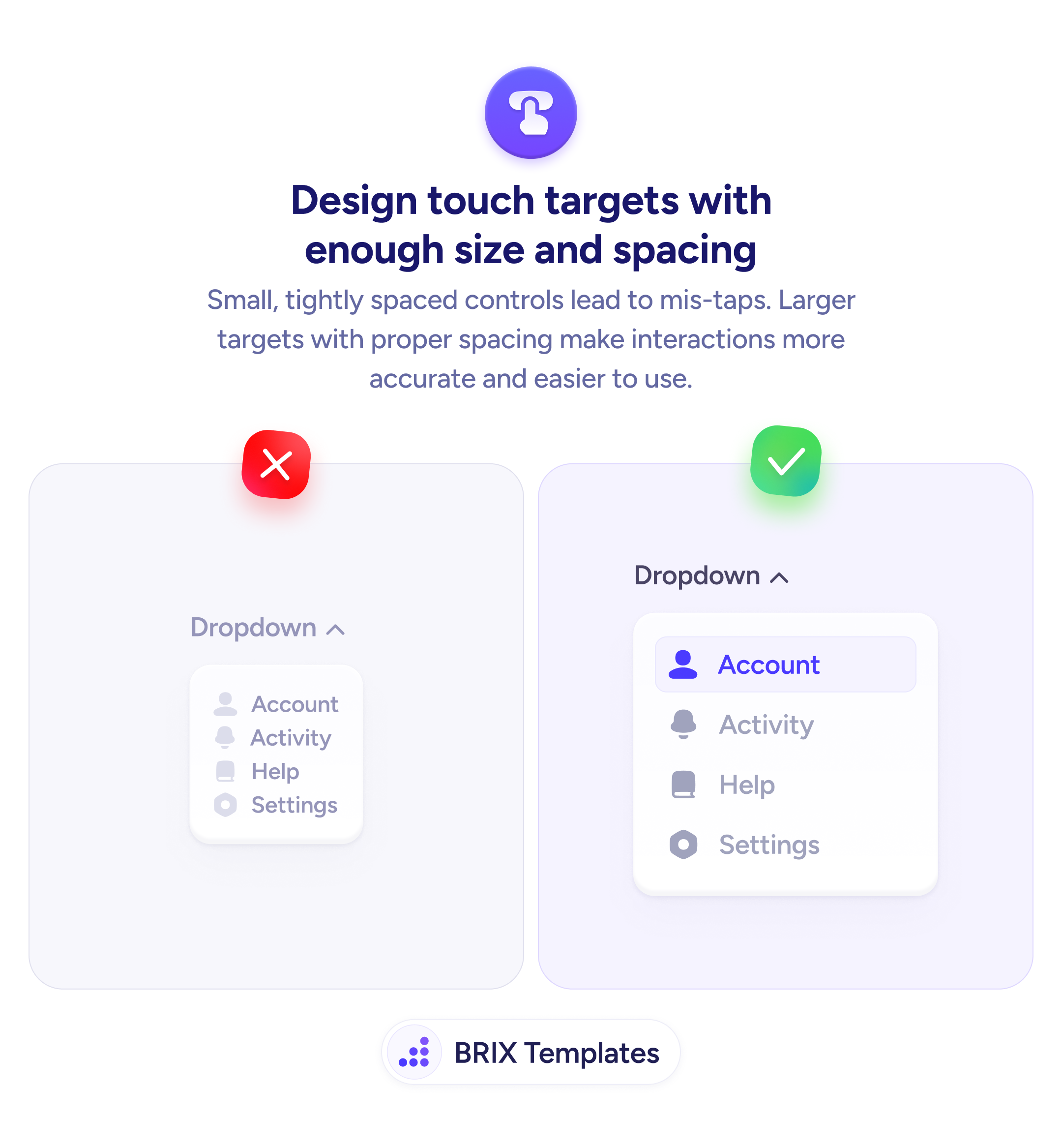
Navigation
If users can't tell there are more slides, those slides don't exist
Users miss carousel content when navigation cues are too subtle. Clear arrows and active dot indicators make it obvious how to interact.
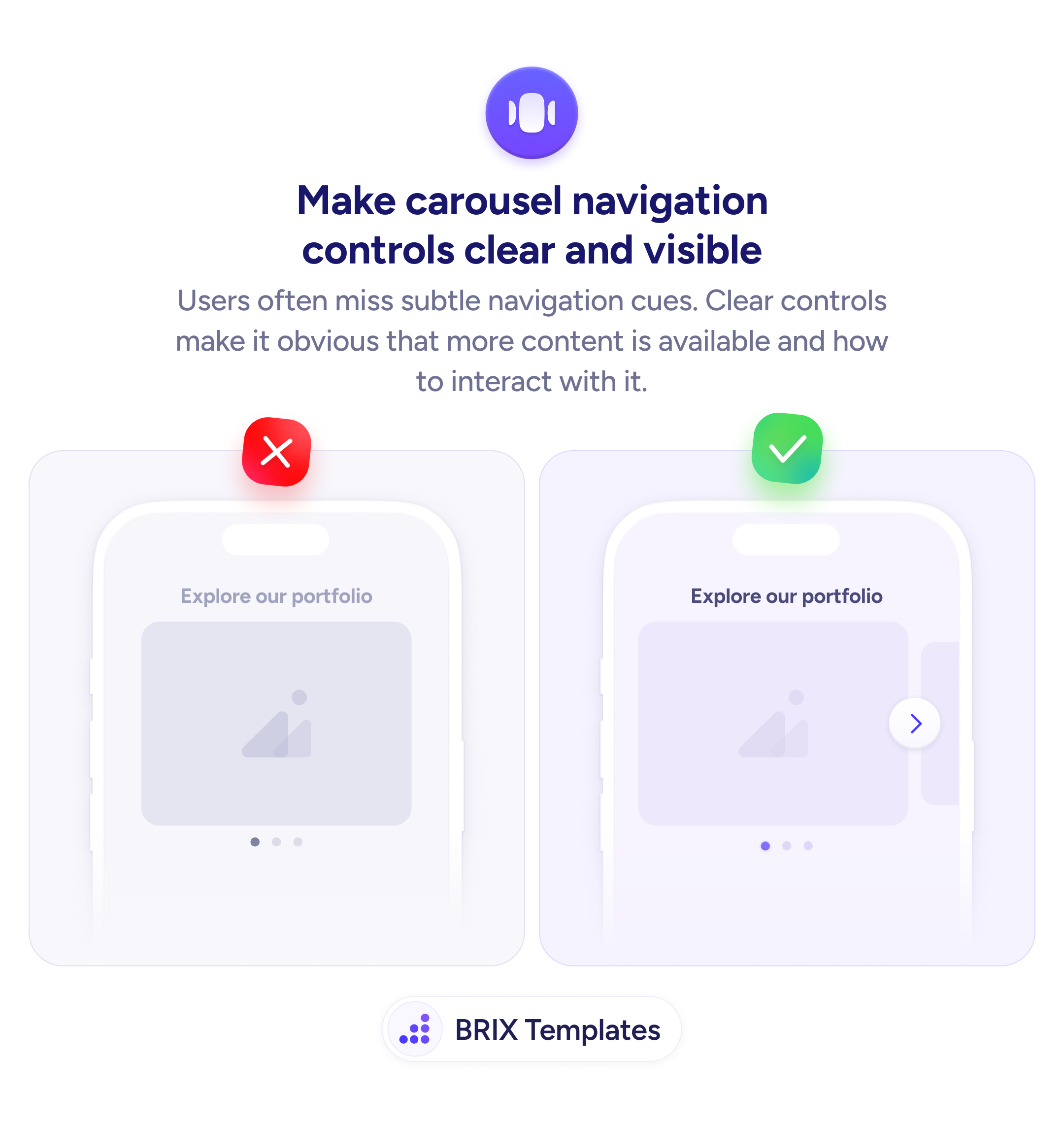
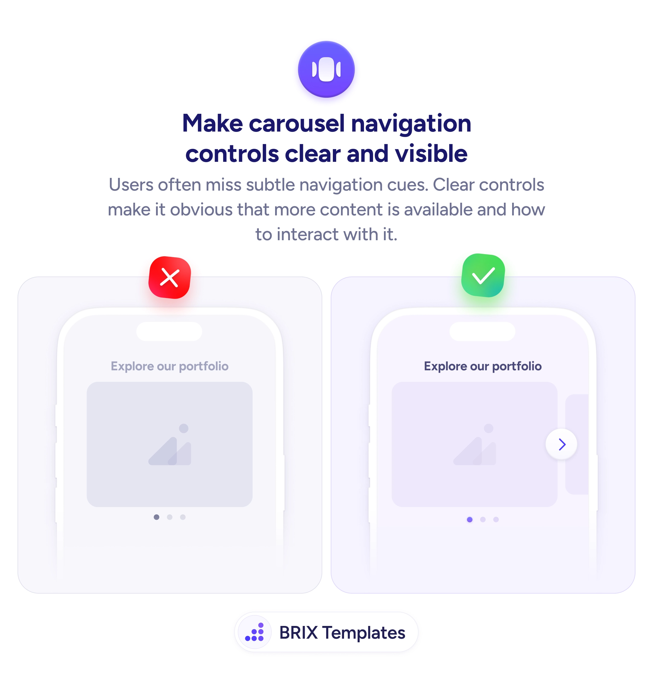
Navigation
If users can't tell there are more slides, those slides don't exist
Users miss carousel content when navigation cues are too subtle. Clear arrows and active dot indicators make it obvious how to interact.
When a carousel relies on subtle navigation cues — tiny dots with no contrast or swipe-only interaction — many users don’t realize there’s more content to see. The first slide gets all the attention, and everything after it is effectively invisible. A carousel with hidden controls is functionally a static image with content trapped behind it.
A better approach is to make navigation controls visually obvious. Add a clear arrow button that signals “there’s more” and use active dot indicators with enough size and contrast to show the user’s position. These controls should look interactive — not decorative — so users immediately understand that the carousel is something they can browse.
Place arrow controls at the edge of the carousel where users naturally look for navigation. Make dots large enough to tap if the carousel supports dot-based navigation. Highlight the active dot with a distinct color or size change so users always know which slide they’re viewing. On mobile, ensure swipe works too, but never rely on it as the only interaction method.
Clear carousel navigation can turn a passive slide into active exploration. Users who can see there’s more content — and know how to reach it — are far more likely to engage with slides beyond the first one.
At minimum, visible arrow buttons on one or both sides and dot indicators that show the current slide position. The arrows signal 'more content exists' and the dots show 'here's where you are.' Both are needed for clear navigation.
At least 44x44px to meet touch target guidelines on mobile. On desktop, they can be slightly smaller but should still be easily clickable. Place them at the horizontal edges of the carousel where users naturally look for navigation.
If possible, yes. Tappable dots let users jump directly to a specific slide, which is especially useful in longer carousels. Make each dot large enough to tap individually — at least 12px with 8px spacing between them.
Use a distinct color, larger size, or filled shape for the active dot compared to inactive ones. The difference should be obvious at a glance — a subtle shade change is not enough. The active indicator tells users where they are in the sequence.