
Navigation
Every mis-tap is a small frustration that adds up to a big one
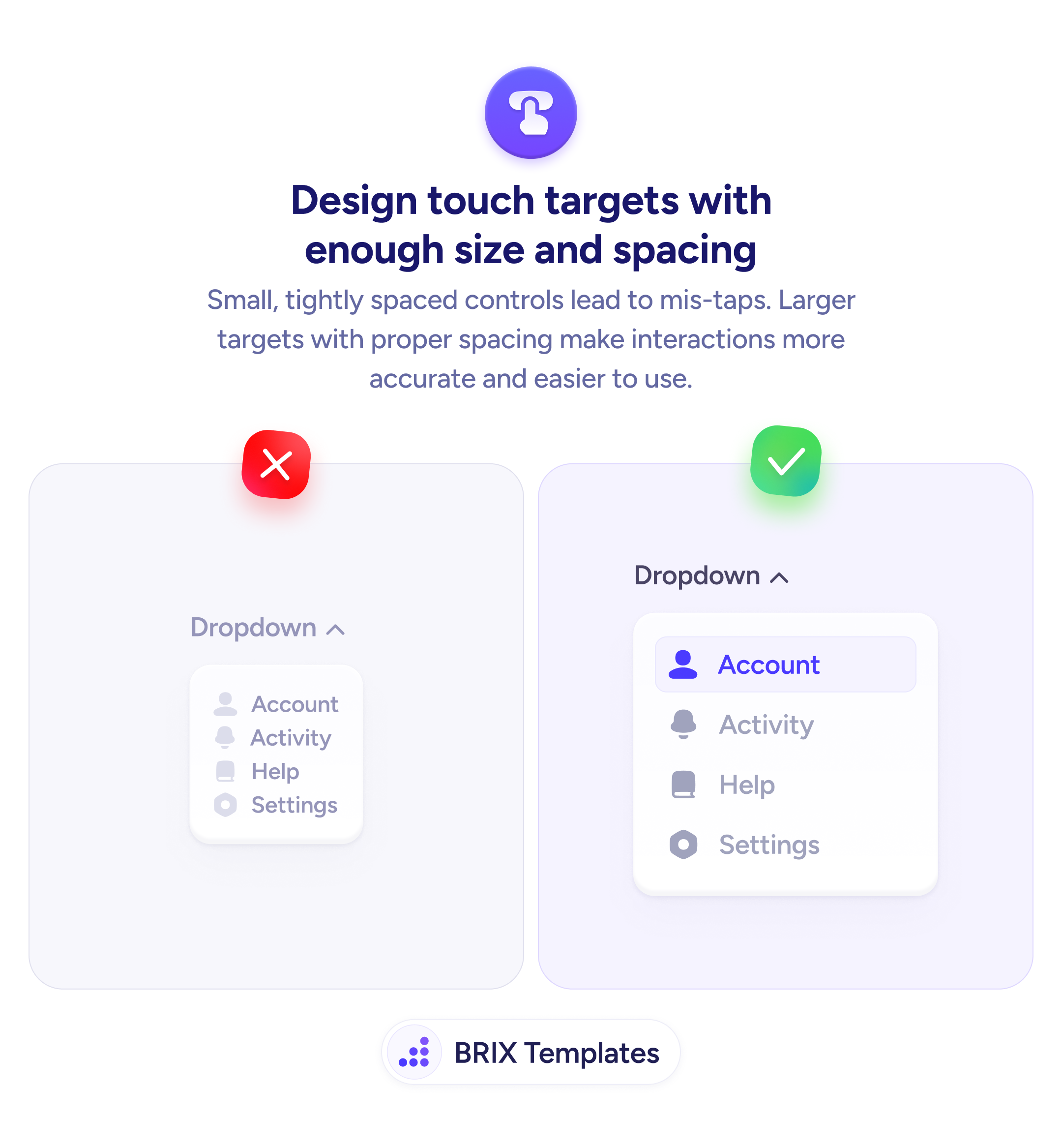
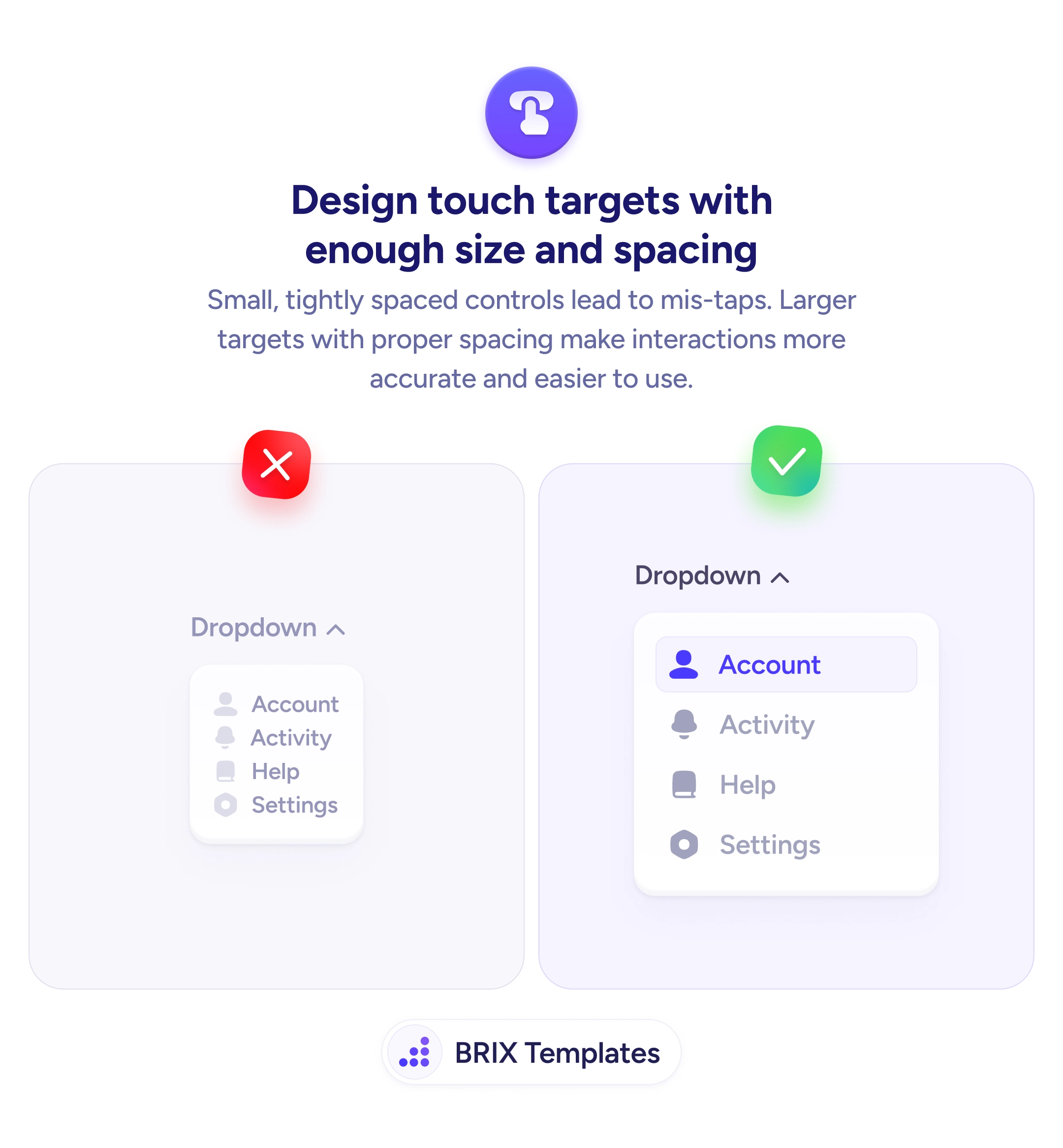
Small, tightly spaced controls lead to mis-taps. Design touch targets with enough size and spacing so users can interact accurately on mobile.
Navigation
Every mis-tap is a small frustration that adds up to a big one
Small, tightly spaced controls lead to mis-taps. Design touch targets with enough size and spacing so users can interact accurately on mobile.
When interactive elements on mobile are small and tightly packed, users frequently tap the wrong item. A dropdown menu with cramped rows, a navigation bar with tiny icons, or a settings list with minimal spacing all create the same problem: the user aims for one target and hits another. Each mis-tap adds frustration and slows down the interaction.
A more reliable approach is to design every interactive element with generous size and clear spacing. The widely accepted minimum is 44×44 pixels for any tappable area, with enough padding between targets to prevent accidental activation of adjacent items. Larger targets with visible spacing make the interface feel more forgiving and easier to use one-handed.
Audit your dropdown menus and lists first — these are where tight spacing causes the most problems. Add vertical padding between each row so items don’t sit directly against each other. Use visual separators or background differentiation to make individual targets obvious. Test with your thumb, not a cursor — a mouse click is precise, but a thumb pad covers a much larger area.
Properly sized touch targets can make mobile interfaces feel responsive and trustworthy. Users who can hit what they’re aiming for on the first try typically move through the interface faster and with less frustration.
44x44 pixels is the widely accepted minimum, recommended by both Apple (Human Interface Guidelines) and WCAG. This ensures most users can tap accurately without hitting adjacent elements.
At least 8px of clear space between adjacent tappable elements. For dense menus or lists, 12-16px is safer. The spacing prevents accidental activation of the wrong item when users tap slightly off-center.
Yes, because dropdown items sit directly adjacent to each other with no natural separation. Each row needs enough height and padding to be individually tappable. Add visible dividers or background differentiation to help users distinguish items.
Add invisible padding to the tappable area using CSS padding on the interactive element itself. The visual appearance stays compact while the actual tap zone extends to the recommended 44x44px minimum.