Readability
Shrinking a desktop page doesn't make it mobile — it just makes it harder to read
Shrinking your desktop layout into mobile creates a cluttered, hard-to-use experience. Prioritize key content and actions first for mobile users.
Readability
Shrinking a desktop page doesn't make it mobile — it just makes it harder to read
Shrinking your desktop layout into mobile creates a cluttered, hard-to-use experience. Prioritize key content and actions first for mobile users.
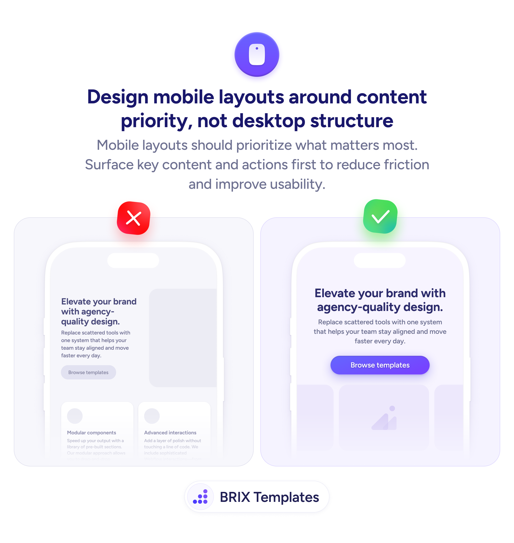
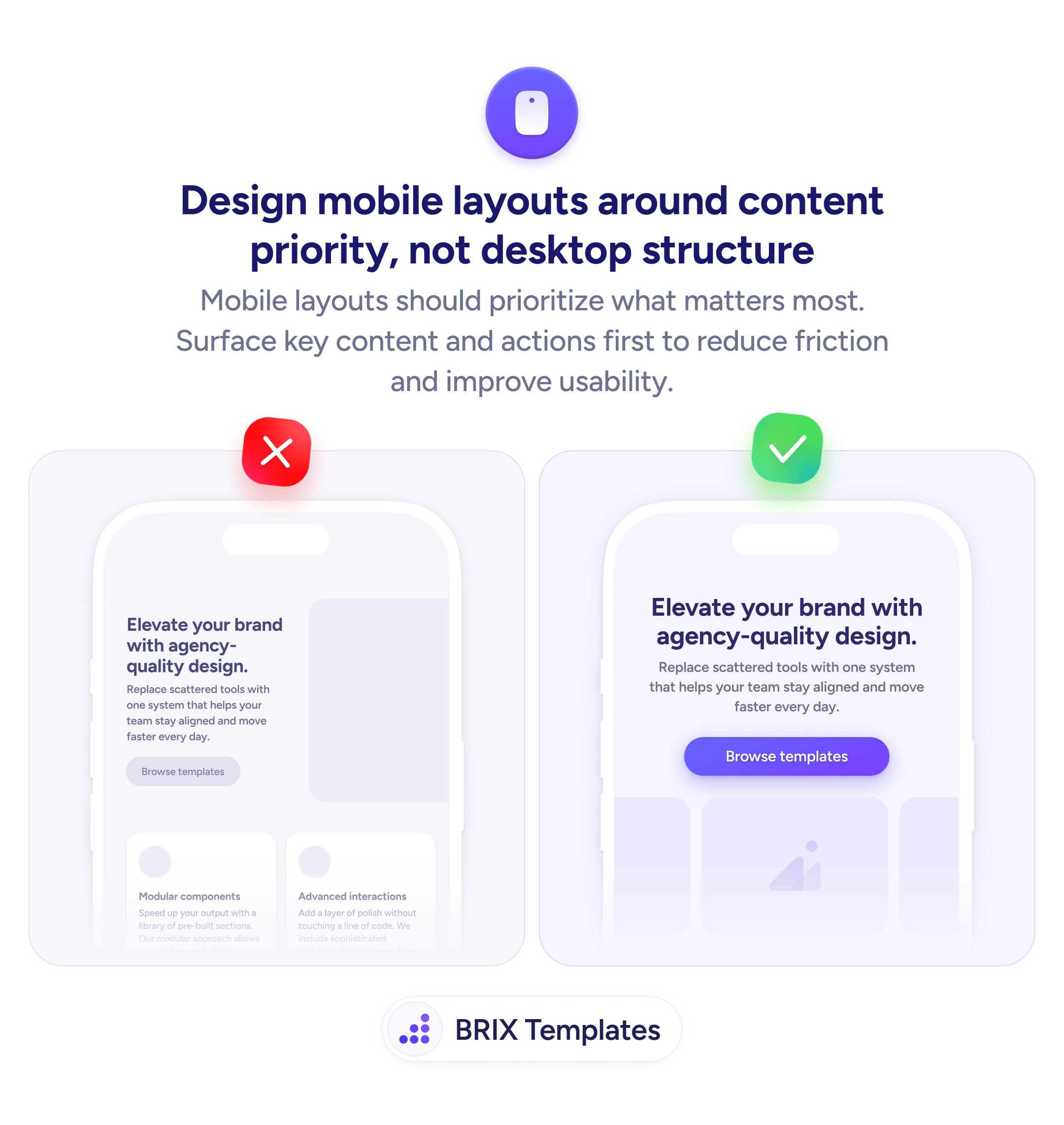
When a desktop layout gets compressed into a mobile screen without rethinking the structure, the result is often a cluttered, cramped page where key content competes with elements that made sense on a wider viewport. Side-by-side feature cards become stacked blocks that push the primary action far below the fold, and secondary information crowds out what mobile users actually came for.
A stronger approach is to redesign the mobile layout around content priority rather than mirroring the desktop structure. Decide what the most important element is for a mobile visitor — usually the headline, value proposition, and CTA — and surface those first. Everything else (feature grids, secondary descriptions, decorative sections) can follow in order of relevance or be deferred entirely.
Start by listing what the mobile user needs to see first, then build the layout in that order. Give the primary CTA full width and prominent contrast so it’s unmissable. Remove or collapse secondary content blocks that add scroll depth without adding decision value. Test on a real device to confirm the first viewport contains enough context for a user to act or decide to scroll.
Content-priority layouts can make mobile pages feel focused and intentional rather than like a shrunk-down desktop page. When mobile users see the most important content first, they typically engage faster and with less frustration.
Start with the one thing the mobile user came for — usually the headline, value proposition, and primary CTA. Everything else (feature grids, testimonials, secondary info) follows in order of relevance to the decision.
Not necessarily hide it, but deprioritize or collapse it. Feature grids and secondary descriptions can move lower or behind an expand toggle. The goal is to surface the most important content first, not to remove information entirely.
Yes, in most cases. A full-width button is easier to tap and more visually prominent on a narrow screen. It also avoids the problem of a small, centered button that looks lost on mobile viewports.
Open the page on a real phone and check what's visible without scrolling. If the headline, value proposition, and primary CTA aren't in the first viewport, the layout needs reordering.