Forms & inputs
Users finish more forms when each step looks like it only takes a moment
A single long form overwhelms users before they start. Split it into multi-step sections with a progress bar to reduce perceived effort.
Forms & inputs
Users finish more forms when each step looks like it only takes a moment
A single long form overwhelms users before they start. Split it into multi-step sections with a progress bar to reduce perceived effort.
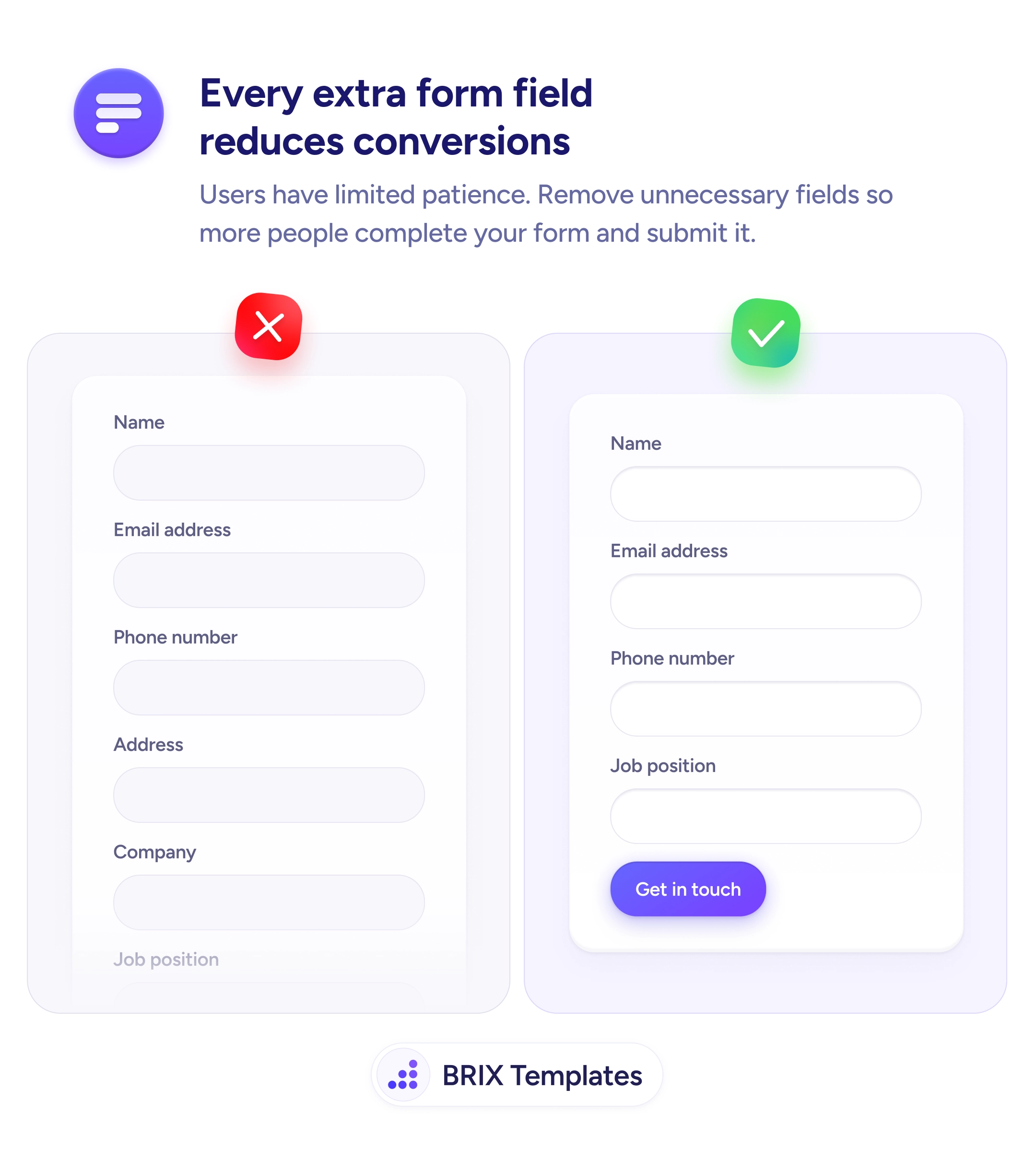
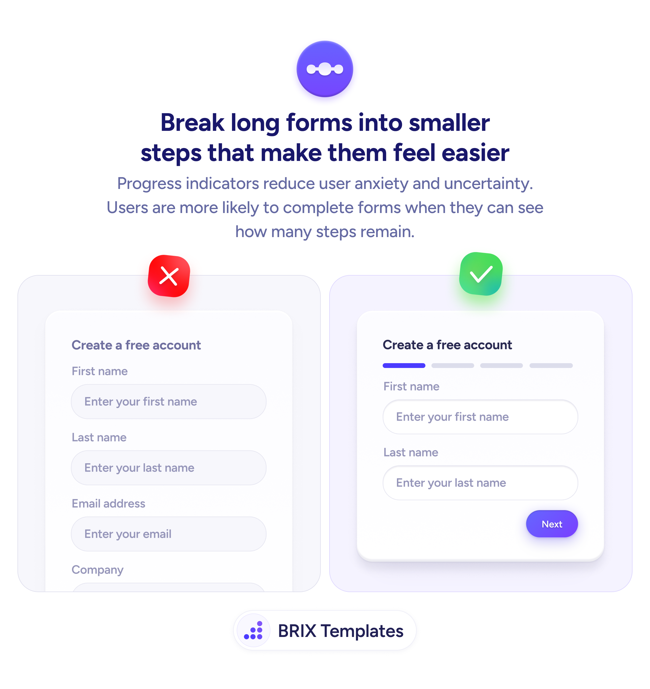
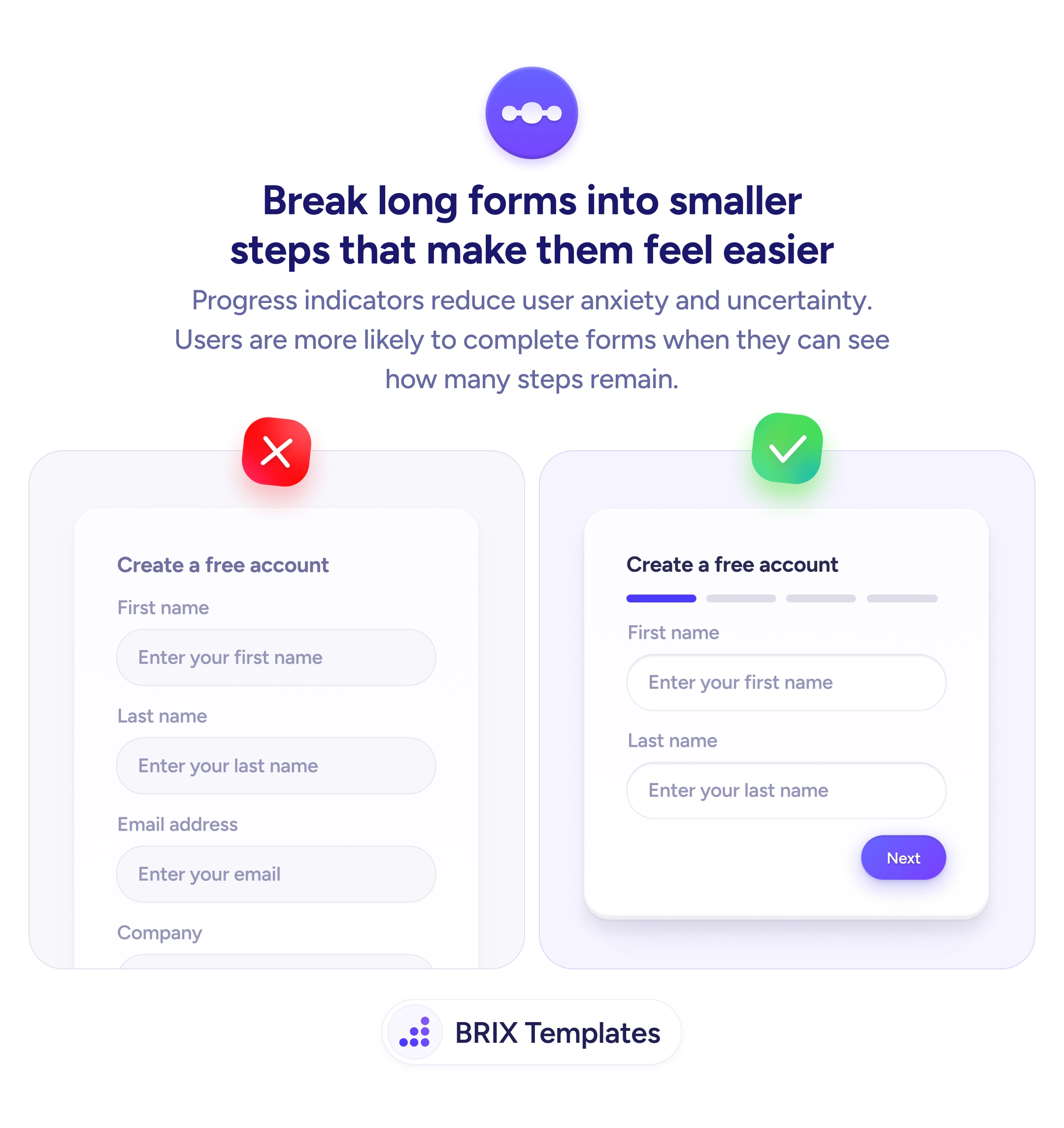
When a form displays every field at once, the sheer volume of inputs can feel like a commitment users haven’t agreed to yet. A long single-page form often triggers a quick mental estimate — “this will take a while” — and that perception alone can drive people away before they type a single character.
A more effective approach is to break the form into logical multi-step sections and add a progress indicator that shows where the user is and how many steps remain. By revealing only a few related fields at a time, each step feels lightweight and achievable. The step-by-step structure also leverages a natural tendency: once someone completes the first easy step, they’re more inclined to continue through the rest.
To implement this, start by grouping related fields together — personal details in one step, account preferences in another. Keep each step to two or three fields when possible so nothing feels dense. Add a clear progress bar or step indicator at the top so users always know their position, and include both “Back” and “Next” buttons so they feel in control rather than locked in.
This kind of progressive disclosure can make a lengthy form feel like a series of small, manageable tasks rather than a single overwhelming wall of inputs. It typically reduces abandonment without removing any fields — just by changing how and when they appear.
Keep each step to two or three related fields. This keeps the perceived effort low and helps users focus on one group of inputs at a time without feeling overwhelmed.
Group fields by topic or purpose — for example, personal details in step one, account preferences in step two, and confirmation in step three. Logical grouping makes each step feel coherent rather than arbitrary.
Yes. A back button gives users control to review or correct earlier answers. Without it, users may feel locked in and abandon the form rather than risk submitting incorrect information.
Place it at the top of the form, above the current step's fields. This position is where users naturally look first and provides immediate context about how far along they are.