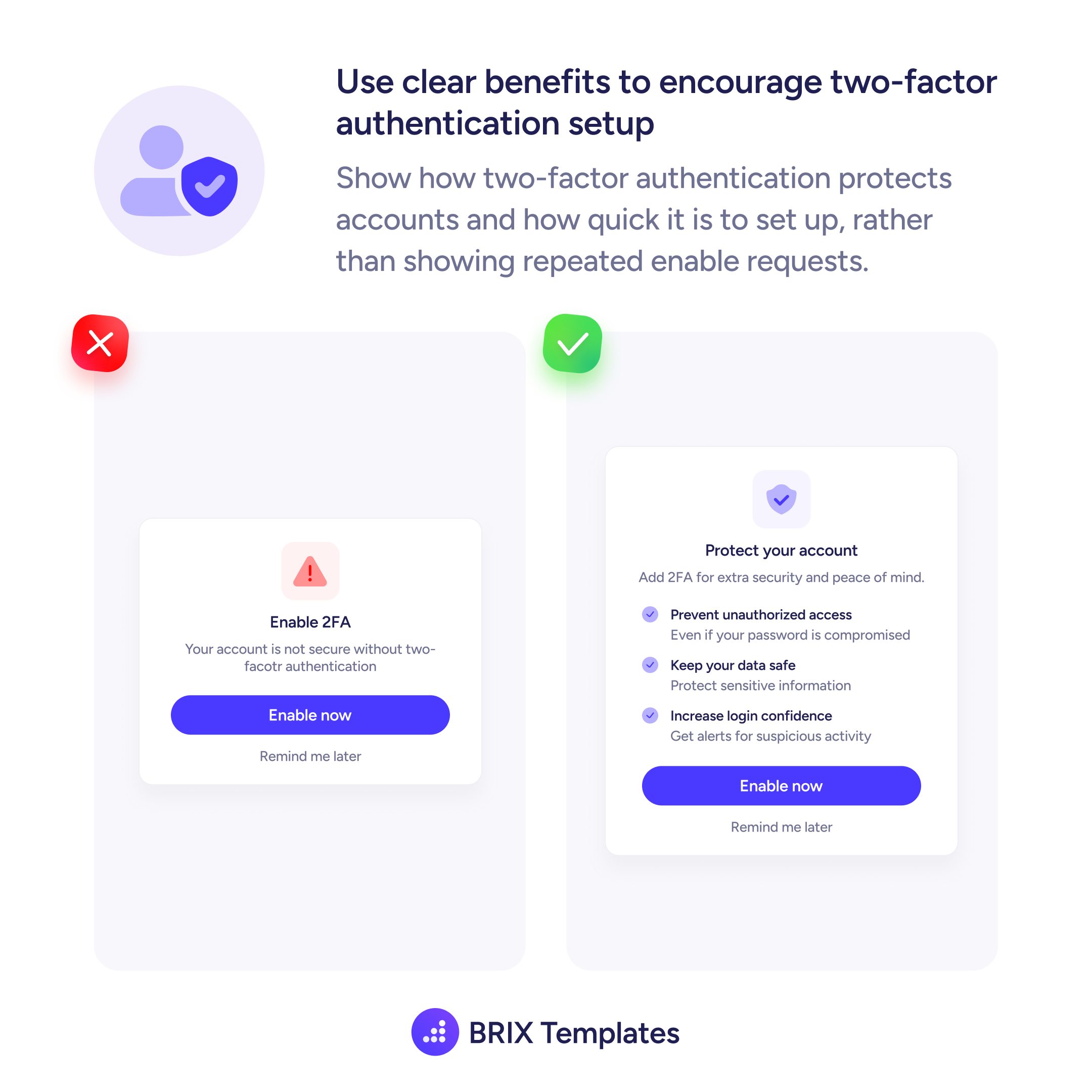
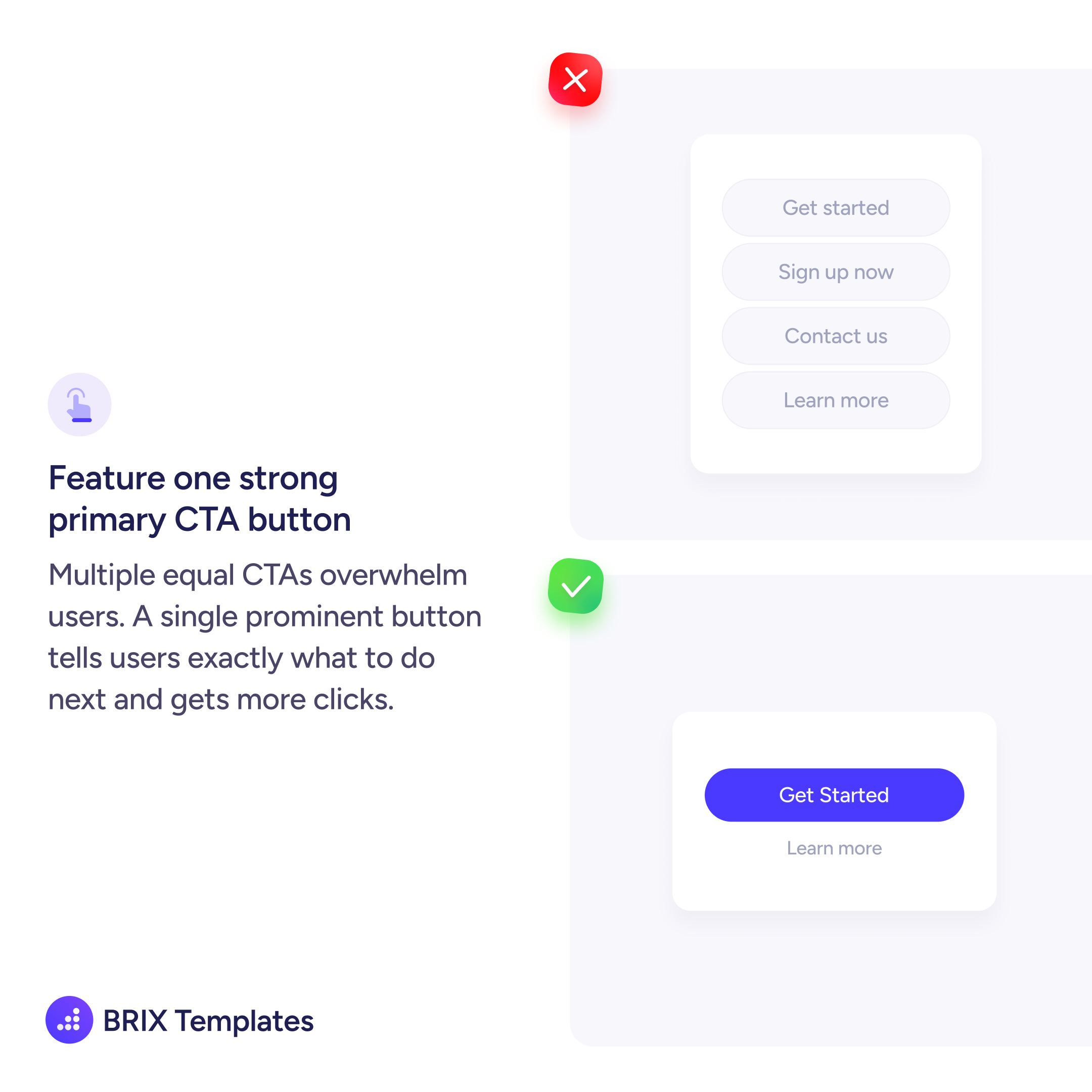
Actions & CTAs
When all buttons look the same, users don't know which to click
Learn how to differentiate primary and secondary buttons using visual hierarchy so users instantly know which action matters most.
Actions & CTAs
When all buttons look the same, users don't know which to click
Learn how to differentiate primary and secondary buttons using visual hierarchy so users instantly know which action matters most.
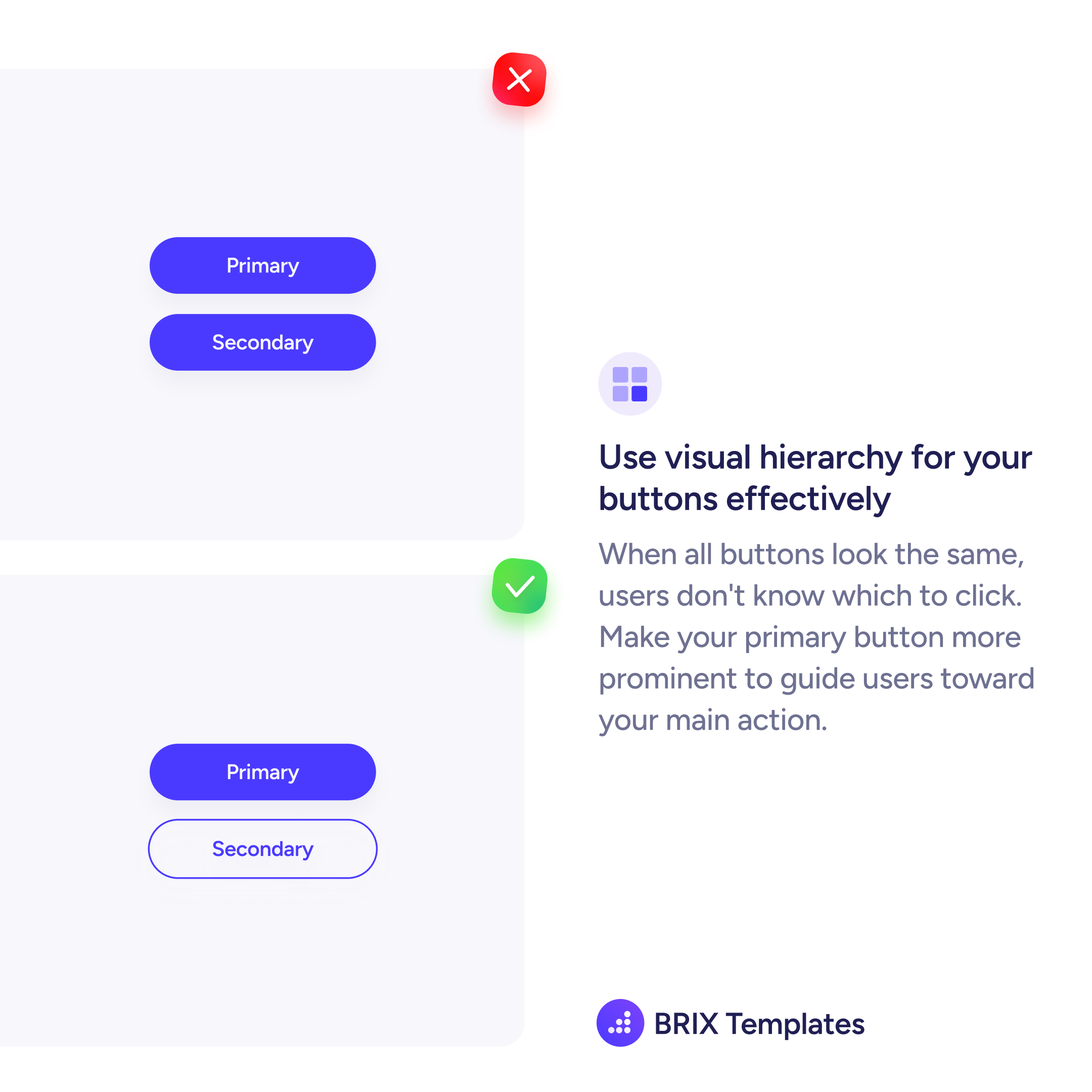
When a primary button and a secondary button share the same visual weight, users lose the signal that tells them where to go. Both buttons look equally important, so the interface fails to guide the decision.
The fix is establishing clear visual hierarchy between button levels. Your primary action gets the filled, high-contrast treatment. The secondary action steps back with an outline or ghost style — still clickable, but visually quieter.
This hierarchy works because it mirrors how users scan: the heaviest visual element draws attention first. When only one button carries that weight, users don’t have to compare — they see the primary action immediately.
Button hierarchy is one of the simplest ways to reduce friction. When the interface clearly says “this is the main action,” users trust it and move forward faster.
A primary button uses a filled background with high contrast to signal the main action. A secondary button uses a lighter treatment — outline, ghost, or text link style — so it stays available without competing for attention.
Not necessarily a different color, but a different visual weight. An outline version of the same color works well. The key is contrast in prominence, not in hue. The primary button should feel heavier and more clickable.
Stick to a clear hierarchy: one filled primary, one outline secondary, and any additional actions as text links. More than three levels of button prominence creates confusion — simplify the action set instead.