
Actions & CTAs
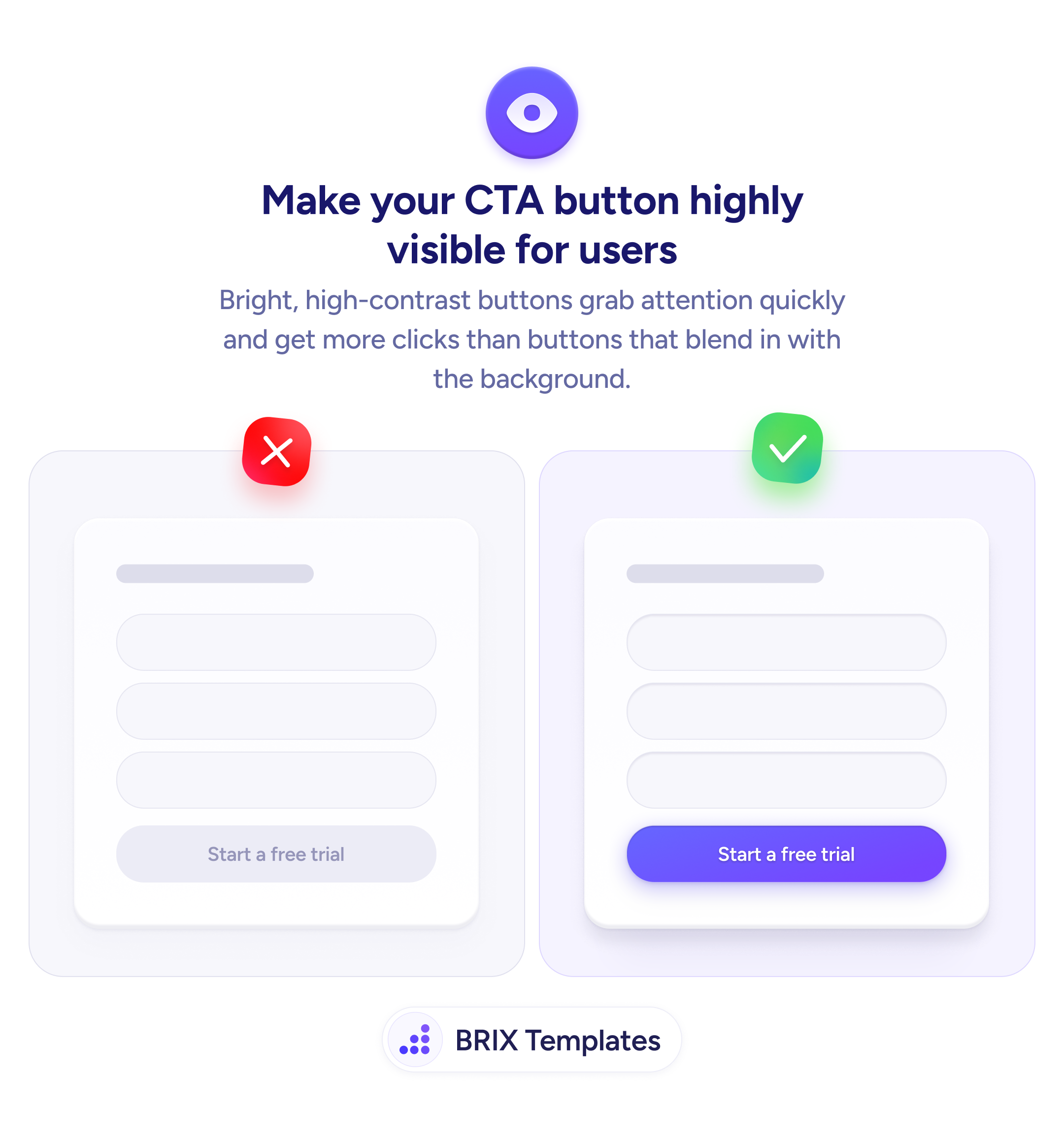
Bright, high-contrast buttons tell users exactly where to click
A low-contrast CTA blends into the page and gets ignored. Apply a bold, high-contrast fill color so the primary action is the first thing users notice.
Actions & CTAs
Bright, high-contrast buttons tell users exactly where to click
A low-contrast CTA blends into the page and gets ignored. Apply a bold, high-contrast fill color so the primary action is the first thing users notice.
When a call-to-action button uses a low-contrast style — matching or nearly matching the surrounding surface — users can overlook it entirely. The button stops reading as an interactive control and starts blending into the page as passive decoration. This adds scanning time and hesitation right at the moment the user is ready to act.
The fix is straightforward: make the primary CTA the most visually prominent element in its section. A high-contrast fill color — typically a saturated brand color against a neutral or white card — immediately signals “this is the main action.” Pair it with legible button text and a clearly tappable size, and the button becomes much harder to overlook.
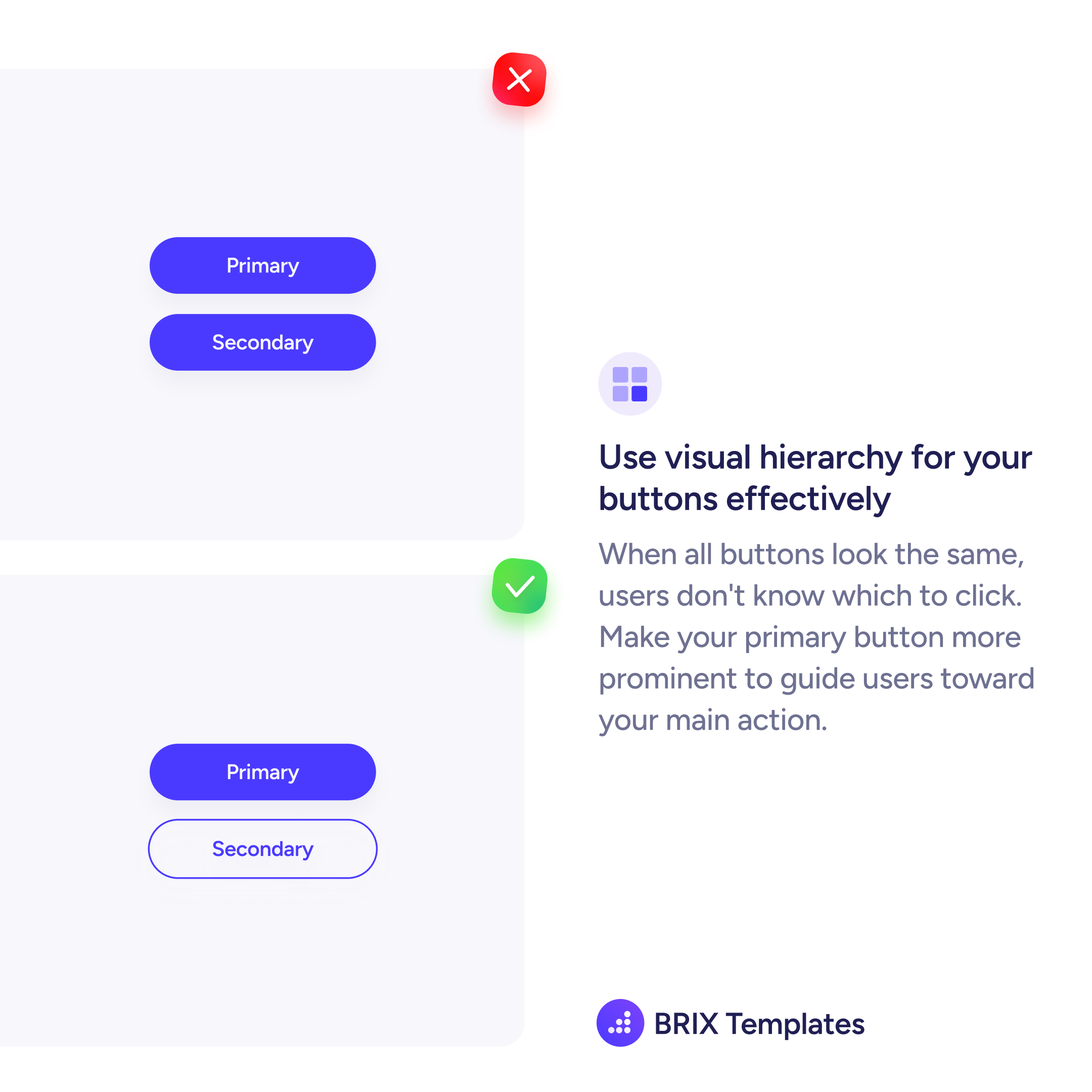
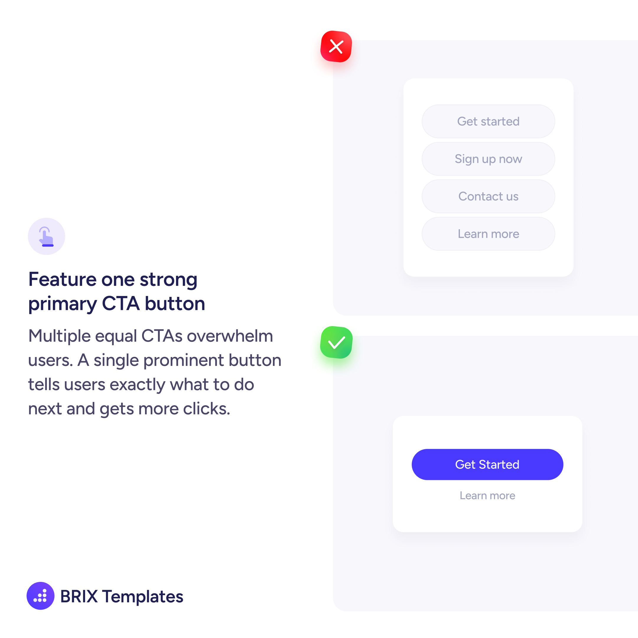
When designing, pick the one action that matters most in that context, then reserve your highest-contrast treatment exclusively for that button. Every other interactive element nearby — inputs, links, secondary actions — should be visually quieter. Competing contrast levels reduce the button’s prominence and reintroduce the scanning problem.
Contrast-led button design can reduce the friction users experience when looking for the next step. It typically improves clarity without changing anything about the offer — just how visible the action is.
Choose a saturated fill color that clearly stands apart from the card or page surface it sits on. Neutral or white backgrounds pair well with solid brand colors; the key is that the button is noticeably different from its immediate surroundings.
Use outline or text link styles for secondary actions, reserving the filled high-contrast treatment exclusively for the primary CTA. When only one button has a solid fill, users naturally read it as the main action.
Yes, but the specific shade matters. Use your brand's most saturated or distinct color for the primary CTA, and ensure the fill creates enough contrast against the background. If your brand palette is mostly muted, a slightly bolder variant of the primary color often works.
Test the button against its actual immediate background, not the overall page. On colored or image backgrounds, you may need a lighter fill, a white button, or an outline with enough weight to separate it clearly from the surface.