
Actions & CTAs
Multiple equal CTAs overwhelm users — feature one strong primary button
Learn why featuring a single prominent CTA button reduces decision fatigue and gets more clicks than presenting multiple equal options.
Actions & CTAs
Multiple equal CTAs overwhelm users — feature one strong primary button
Learn why featuring a single prominent CTA button reduces decision fatigue and gets more clicks than presenting multiple equal options.
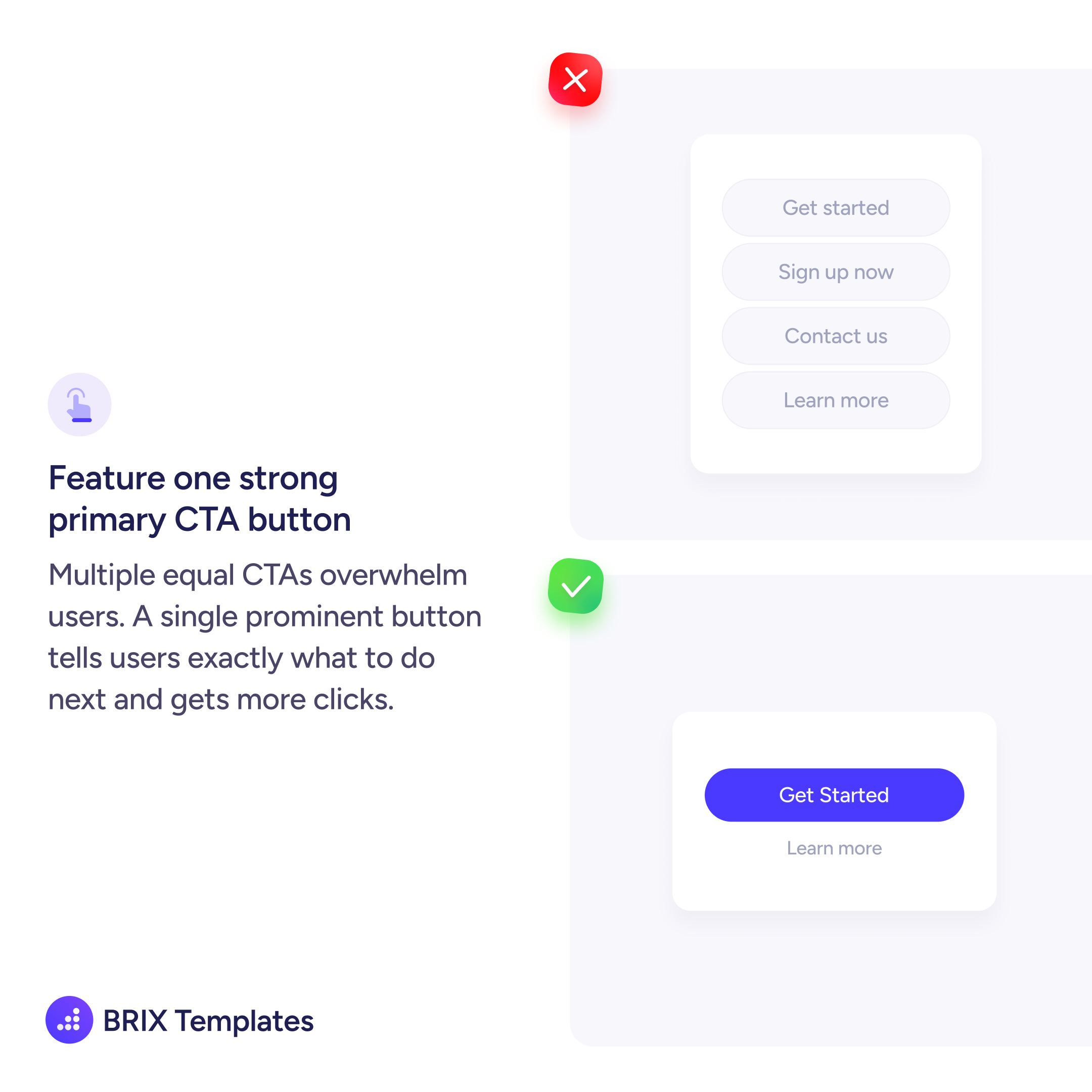
When every button in a section looks the same, users have to read and compare each option before deciding. That added friction slows them down — and in many cases, they click nothing at all.
A stronger pattern is to feature one clear primary CTA and visually demote everything else. The primary button should be the only filled, high-contrast element in its cluster. Secondary actions like “Learn more” or “Contact us” can use text links or outline styles that stay accessible but don’t compete.
Start by identifying the single most important action for that moment. If you’re on a pricing page, it might be “Get started.” On a product page, “Add to cart.” Everything else is supporting context.
This kind of single-CTA focus reduces decision fatigue and makes the next step obvious. Users don’t have to think about which button to click — there’s only one clear answer.
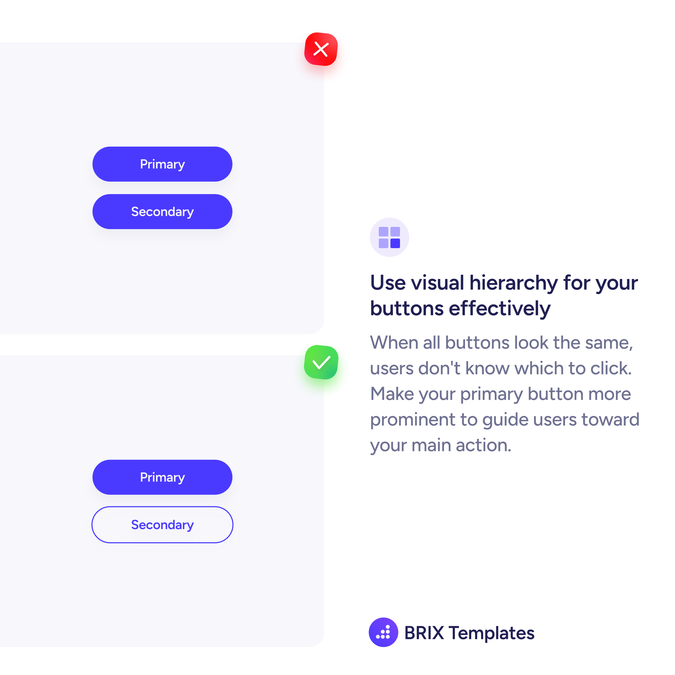
A section should have one primary CTA button. You can include secondary actions (text links, outline buttons), but only one button should carry the strongest visual weight. This tells users exactly where to click without forcing them to compare options.
Keep the primary CTA as a filled, high-contrast button and demote everything else to lighter treatments — outline buttons, text links, or smaller type. The visual gap between primary and secondary should be obvious at a glance.
Yes. When users face multiple equally-styled buttons, they spend time comparing instead of acting. A single prominent CTA removes that friction and channels attention toward the action you want them to take.