
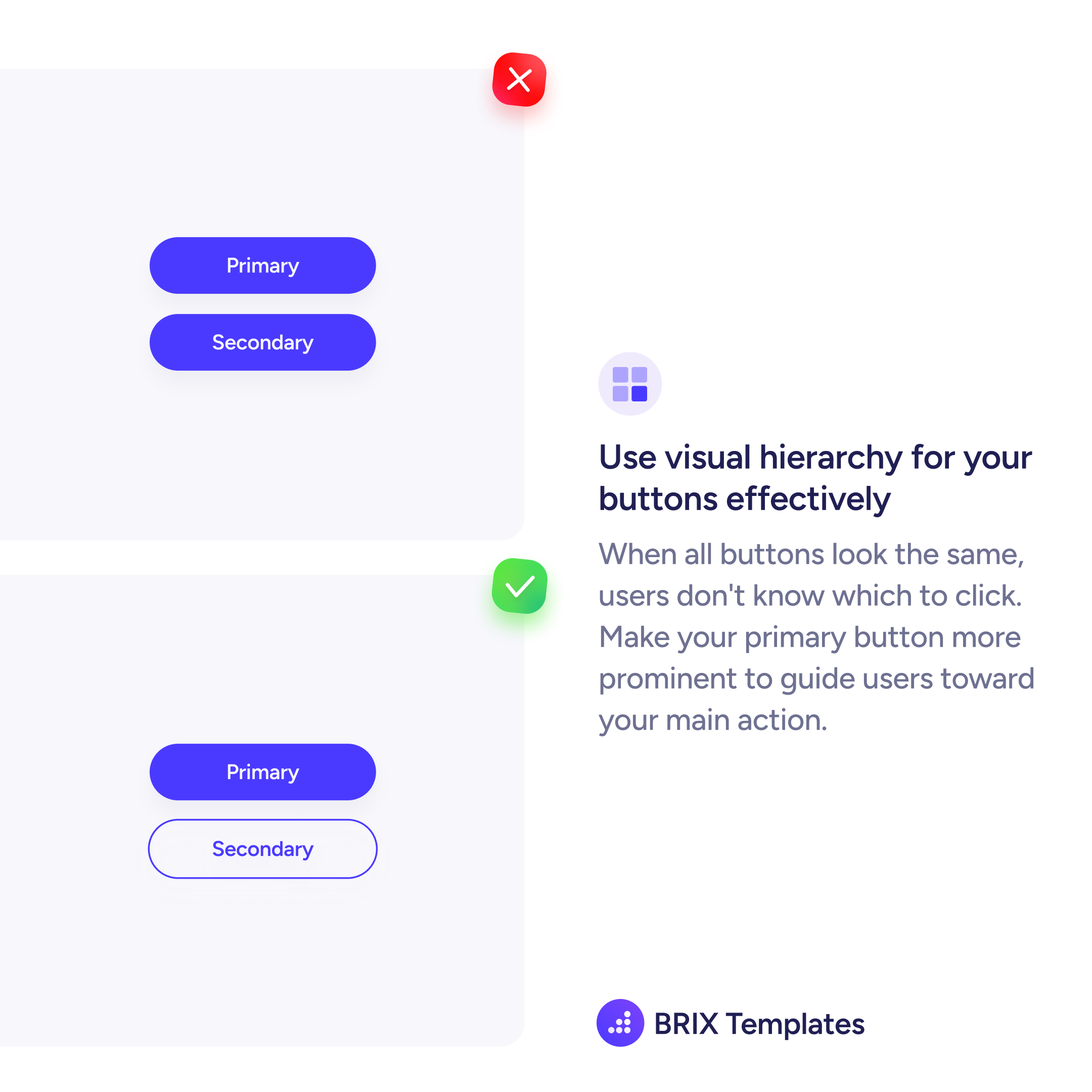
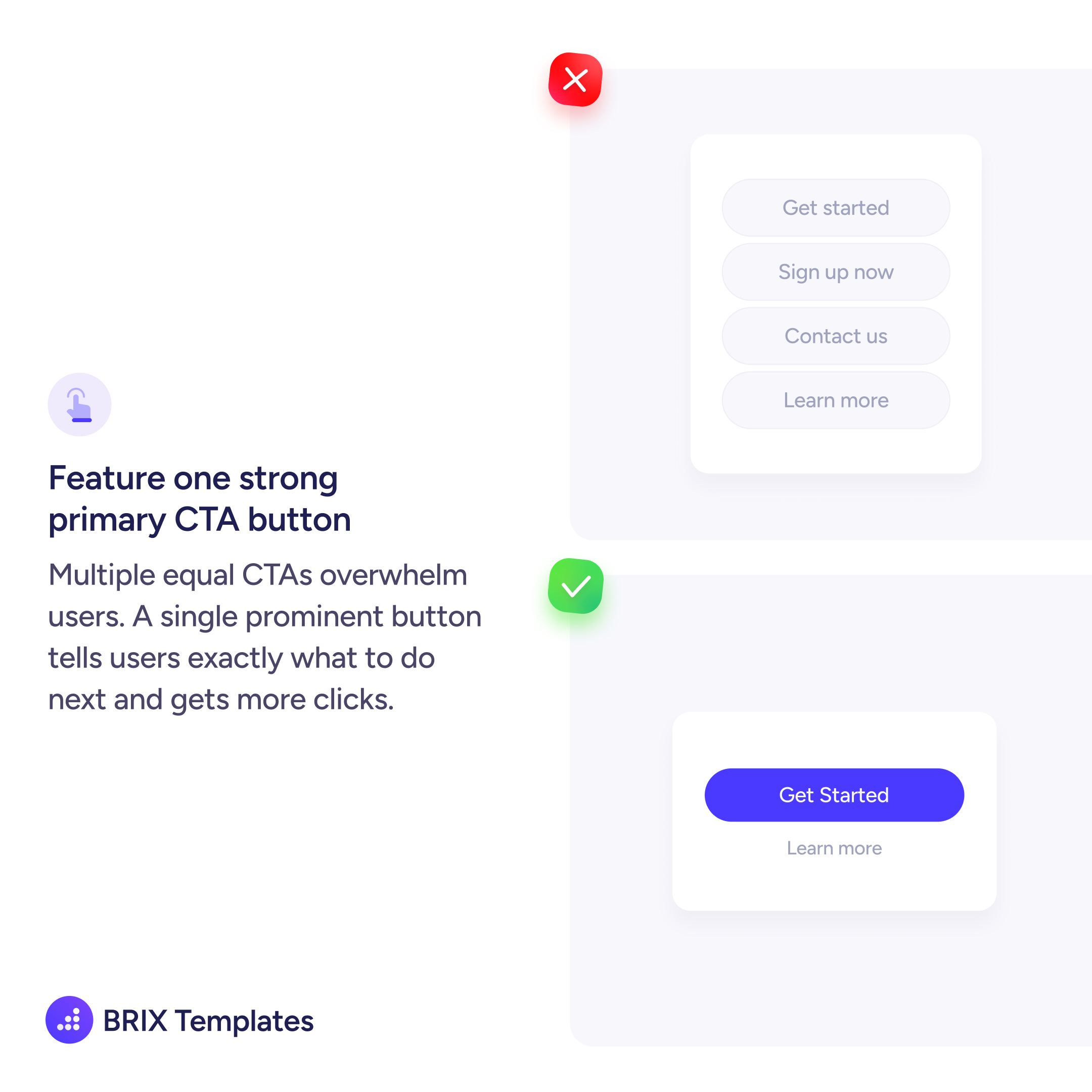
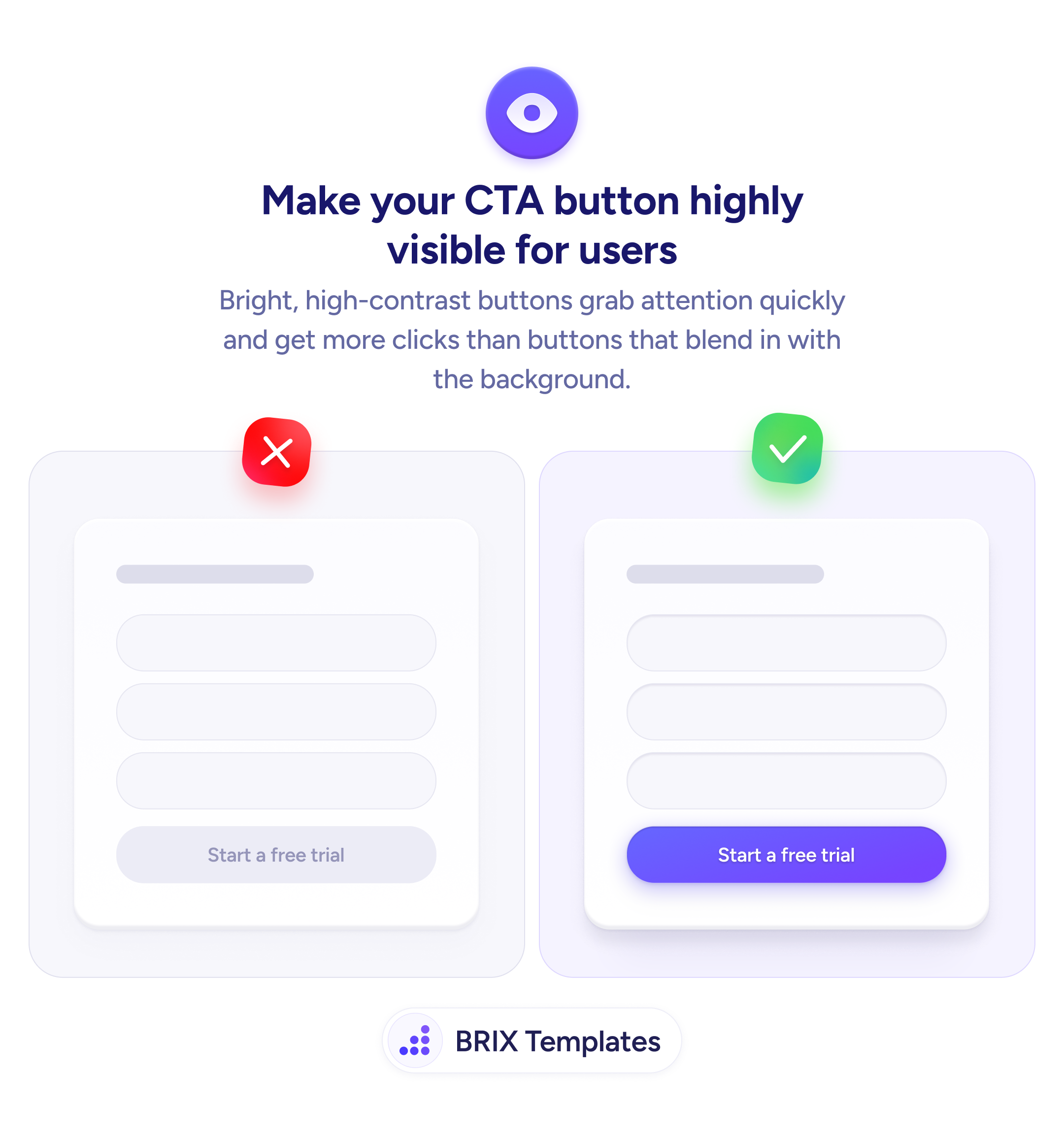
Bright, high-contrast buttons tell users exactly where to click
A low-contrast CTA blends into the page and gets ignored. Apply a bold, high-contrast fill color so the primary action is the first thing users notice.
1 tip curated around Actions & CTAs best practices.