Status & feedback
An error that doesn't explain itself is just a dead end
Generic errors like 'There was an error' leave users stuck. Specific inline messages that show an example help users fix issues fast.
Status & feedback
An error that doesn't explain itself is just a dead end
Generic errors like 'There was an error' leave users stuck. Specific inline messages that show an example help users fix issues fast.
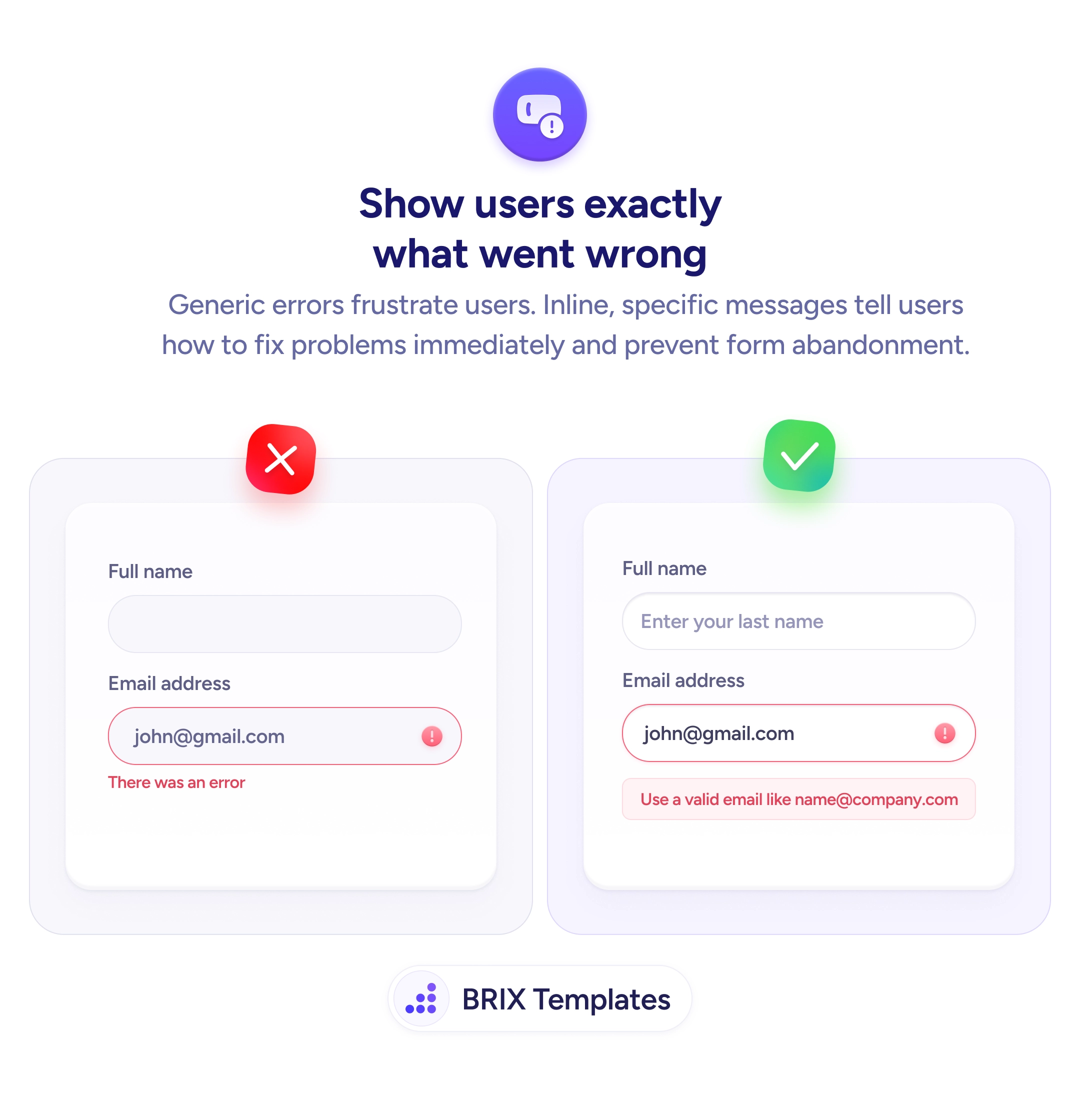
When a form shows a generic error message — “There was an error” or “Invalid input” — users know something is wrong but not what, or how to fix it. This forces them to guess: was the email format wrong? Did a field get missed? That uncertainty costs time and erodes confidence in the form. For users already hesitant about submitting, an unexplained error is often the final reason to abandon.
The reliable fix is inline error messages that are specific and instructive. Rather than a blanket error, attach the message to the exact field that failed. State what went wrong and, where possible, show an example of what valid input looks like. “Use a valid email like [email protected]” tells the user precisely what the field expects — no guesswork required. This keeps the user on task instead of sending them searching for what “error” means.
When writing error messages, think of the message as a prompt, not a penalty. The user isn’t being told off — they’re being guided. Use plain language — “Your email address doesn’t look right” is clearer than “Input validation failed”. Give the format example as a hint, keep it brief, and position it directly under the field it applies to.
Specific, well-placed error messages can significantly reduce form abandonment at the validation stage. Users who understand exactly what to fix are far more likely to correct the entry and complete the form than users confronted with a message that offers no direction.
Specific enough that the user knows which field failed, why it failed, and how to fix it. The ideal message names the field, describes the problem in plain language, and includes a correct-format example when the format is the likely issue.
Yes, when the error relates to format. A message like 'Use a valid email like [email protected]' is more actionable than 'Invalid email address' because it removes ambiguity about what correct input looks like. Keep the example brief and representative.
1–2 sentences maximum. The user is already in a frustrating moment — they don't need a paragraph. Enough to identify the problem and show the fix. 'Phone number must be 10 digits, like 555-867-5309' is sufficient.
Neither. Error messages should be neutral and helpful — directing the user toward a fix, not placing blame. 'This field is required' is better than 'You forgot to fill in your name.' Frame it as guidance, not a scolding.