Forms & inputs
Every field you ask for is a hurdle between the user and the submit button
Every field you add to a form is a reason to stop. Remove non-essential fields and more users will complete it.
Forms & inputs
Every field you ask for is a hurdle between the user and the submit button
Every field you add to a form is a reason to stop. Remove non-essential fields and more users will complete it.
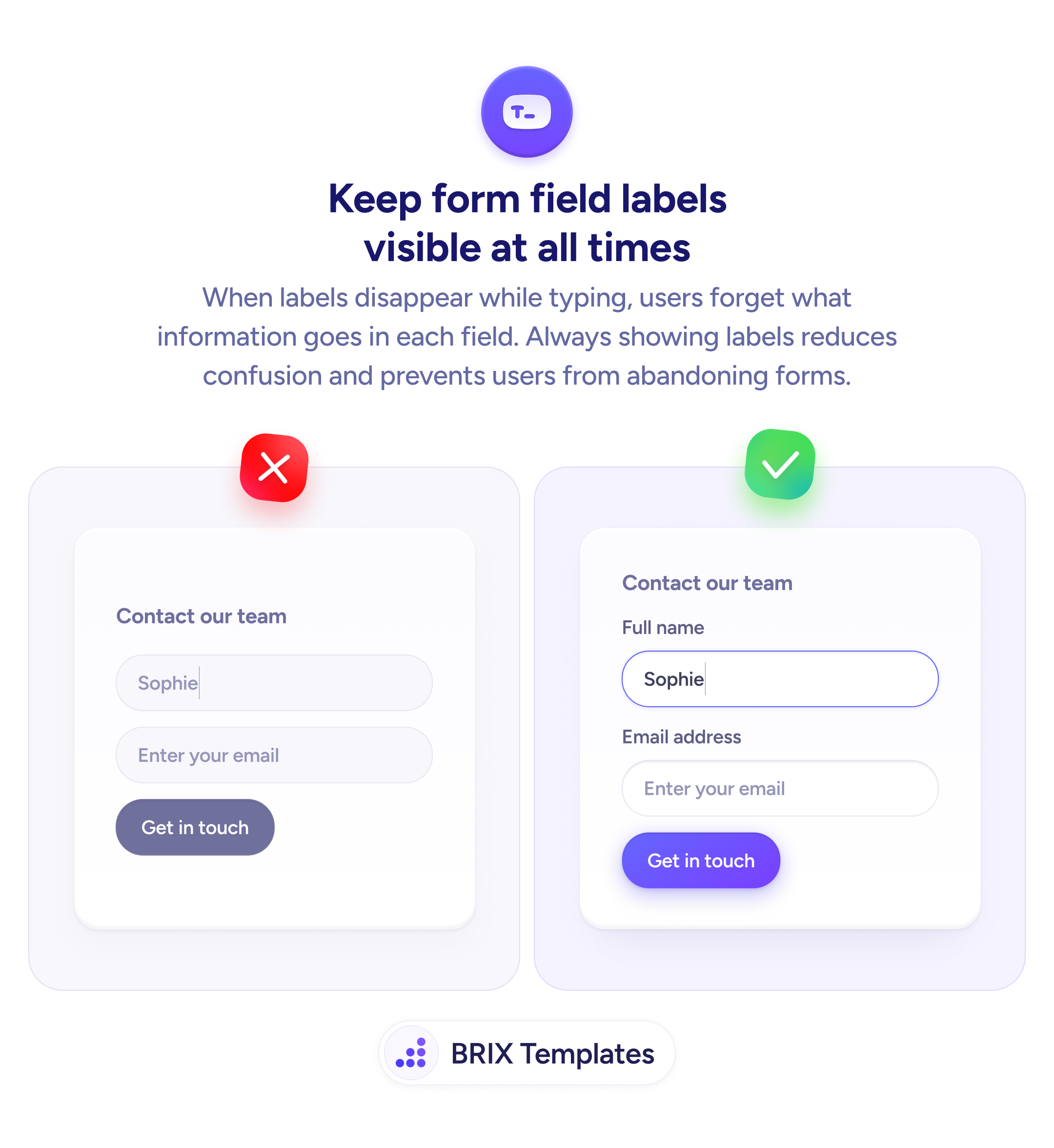
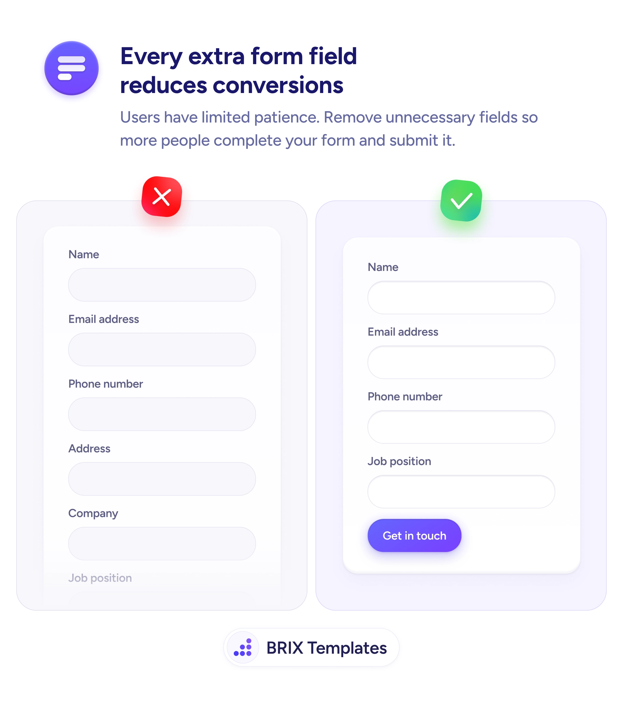
Every field on a form adds time, effort, and a new opportunity for the user to stop. A form with many fields creates a visible wall of inputs that can discourage users from starting, and a higher barrier to finishing. This effect compounds when some fields feel unnecessary for the context — asking for an address on a demo request, or a job title for a newsletter signup, signals the form wasn’t designed with the user’s situation in mind.
The fix is to reduce the form to the minimum required to move forward. For a contact or demo request, name and email are almost always sufficient. Phone number, company, and role can be gathered later in the process, once the user has committed. Ask yourself what’s genuinely needed at this step, not what might be useful to have.
When auditing a form, treat each field as a trade-off: the data it collects versus the friction it adds and the conversions it may prevent. Some fields are worth the friction — a payment form genuinely needs billing details. Others are convenience data for the sales team, not requirements for the user. Make the form as short as possible first, then add fields back only with a clear reason.
Shorter forms can meaningfully increase completion rates, particularly on acquisition and lead capture pages. The information you don’t ask for today can often be gathered through later interactions — after trust is established.
For a basic contact or inquiry form, 2–3 fields are often enough: name, email, and optionally a message or phone number. Add fields only when the information is genuinely required to process the request — not because it would be convenient to have.
Start with fields that collect data for internal use rather than the user's benefit: job title, company size, department, how you heard about us. These are often low-value asks from the user's perspective and can be gathered later or inferred.
Yes. Application forms, detailed bookings, and financial forms often need many fields because the process genuinely requires the information upfront. The principle applies most to acquisition and lead capture forms, where the cost of a long form is highest.
Optional fields still add visual length and cognitive overhead. If a field is truly optional, consider whether it adds value for the user rather than just for you. If not, remove it — a visually shorter form is easier to approach.