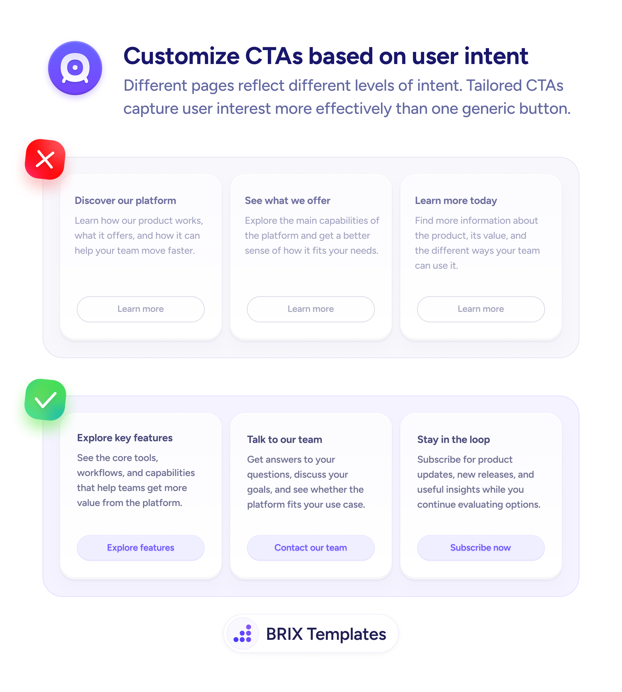
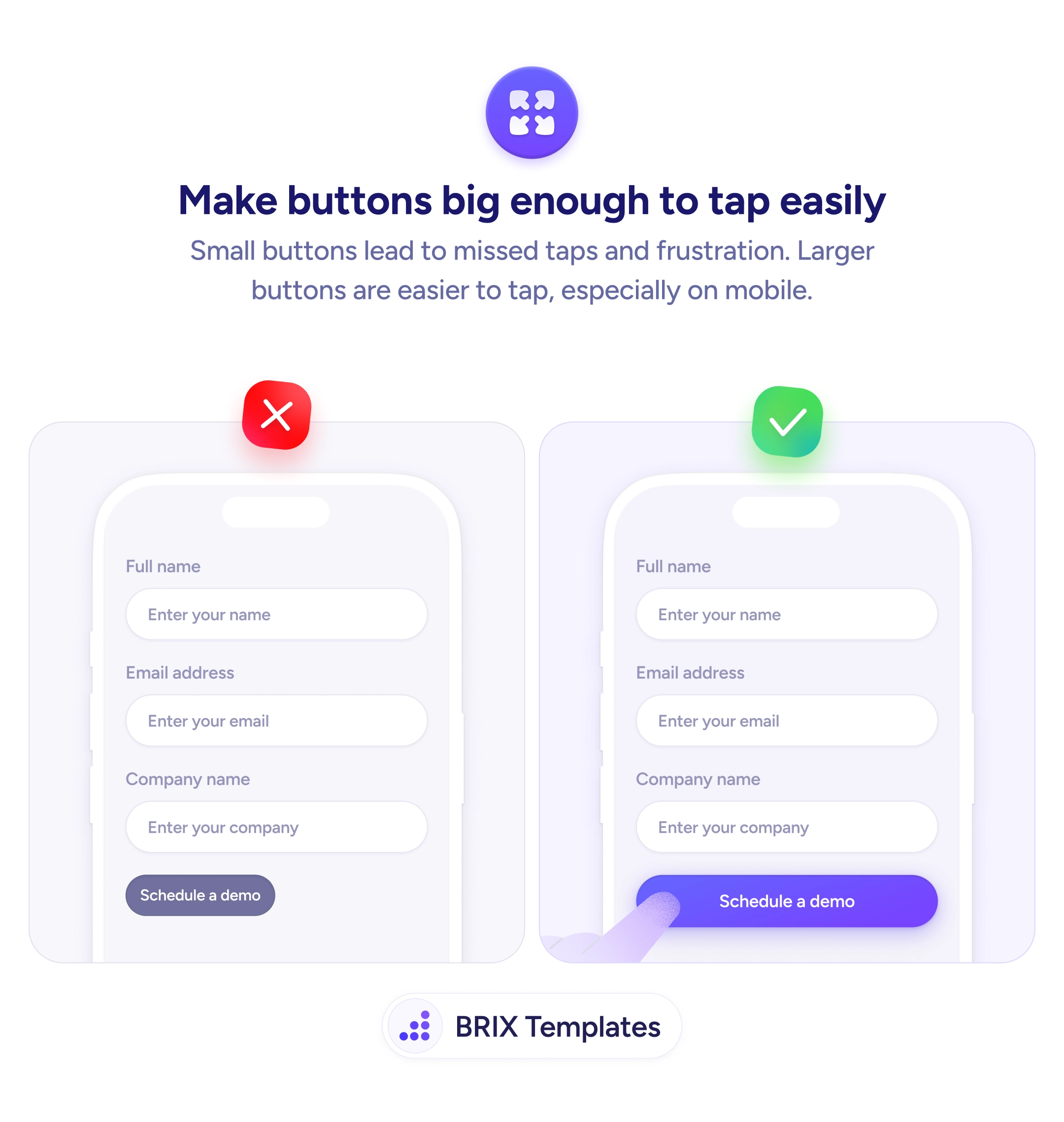
Actions & CTAs
A button users can't reliably tap is a button that doesn't work
Small buttons force users to tap repeatedly to hit the target. Use full-width or generously padded CTAs to reduce missed taps on mobile.
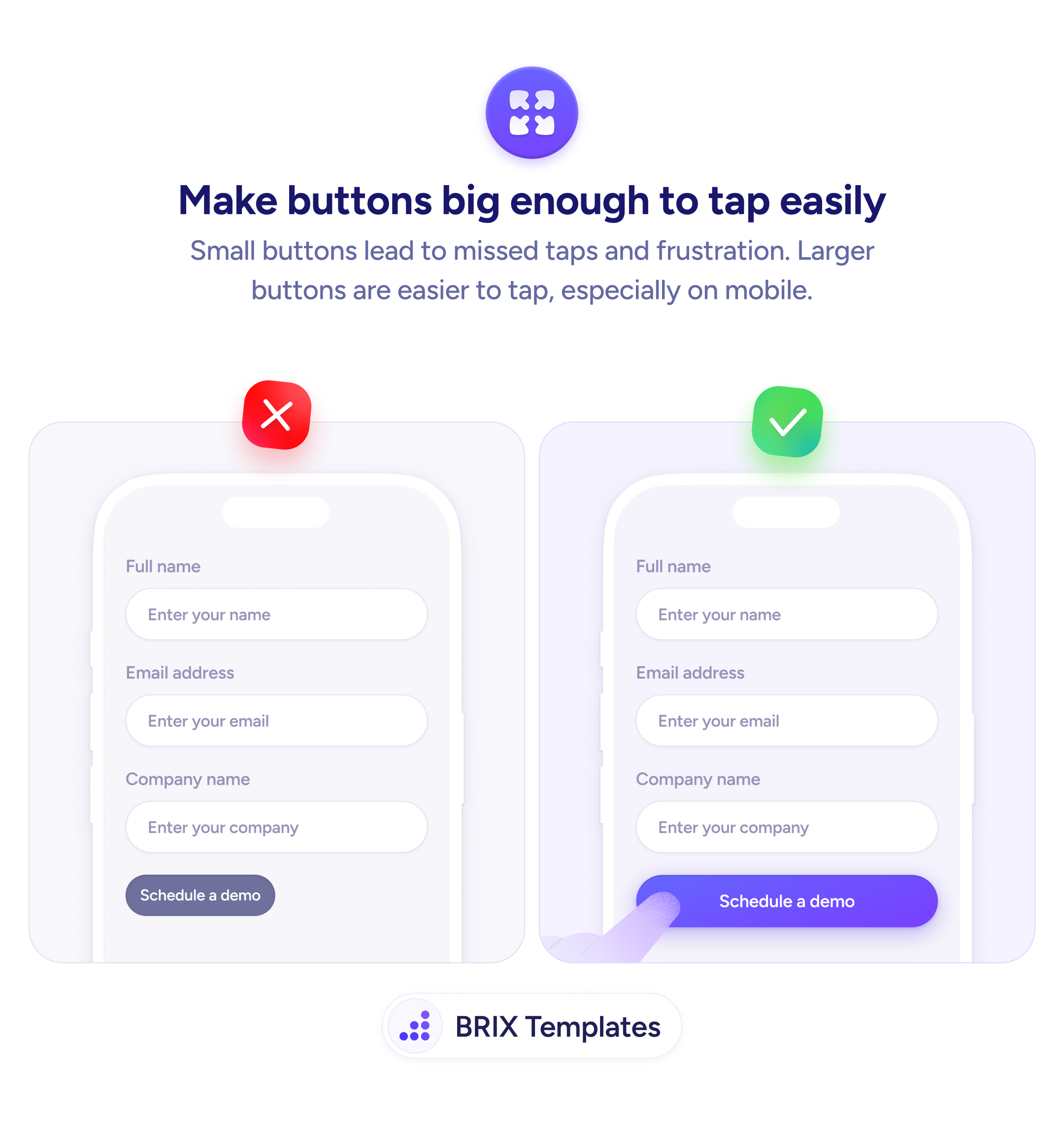
Actions & CTAs
A button users can't reliably tap is a button that doesn't work
Small buttons force users to tap repeatedly to hit the target. Use full-width or generously padded CTAs to reduce missed taps on mobile.
On mobile, a touch target that is too small forces users to aim precisely at a narrow area to trigger a button. When a tap misses, the user has to try again — and on a form submit button, repeated misses erode confidence and can lead to abandonment. The problem is especially common with buttons that match the label text width rather than filling the available space.
The reliable fix is to give primary CTA buttons a generous tap area. A full-width button spanning the form or card width ensures that any tap in a reasonable area registers correctly. At minimum, the button height should meet the widely accepted 44×44px minimum touch target, with enough padding to make the target area larger than the text itself.
When designing mobile forms, think of the button size as part of the UX contract: a wide, clearly padded button signals that the interface is easy to use. Avoid sizing buttons to match text length — the label determines what the button says, not how large its tap area should be.
Button size is one of the cheapest usability improvements on mobile. A wider, taller button can reduce missed taps and help users complete the action they intended without second-guessing.
Apple's HIG and Google's Material Design both recommend a minimum tap target of 44×44pt or 48×48dp respectively. In practice, aim for at least 44px in height and as wide as the layout allows for primary CTAs.
Full-width works well for primary CTAs inside forms or cards on mobile — it maximizes the tap area and aligns with native app patterns. For secondary actions, full-width can be too heavy; use a narrower centered button instead.
At least 12–16px vertically is a good baseline. The goal is to make the visible button area extend well beyond the text label so the tap zone is generous. Less than 10px vertical padding typically results in buttons that feel cramped.
Yes. A larger button carries more visual weight and reads as a more significant action. This is useful for primary CTAs but means you should keep secondary actions smaller to preserve hierarchy.