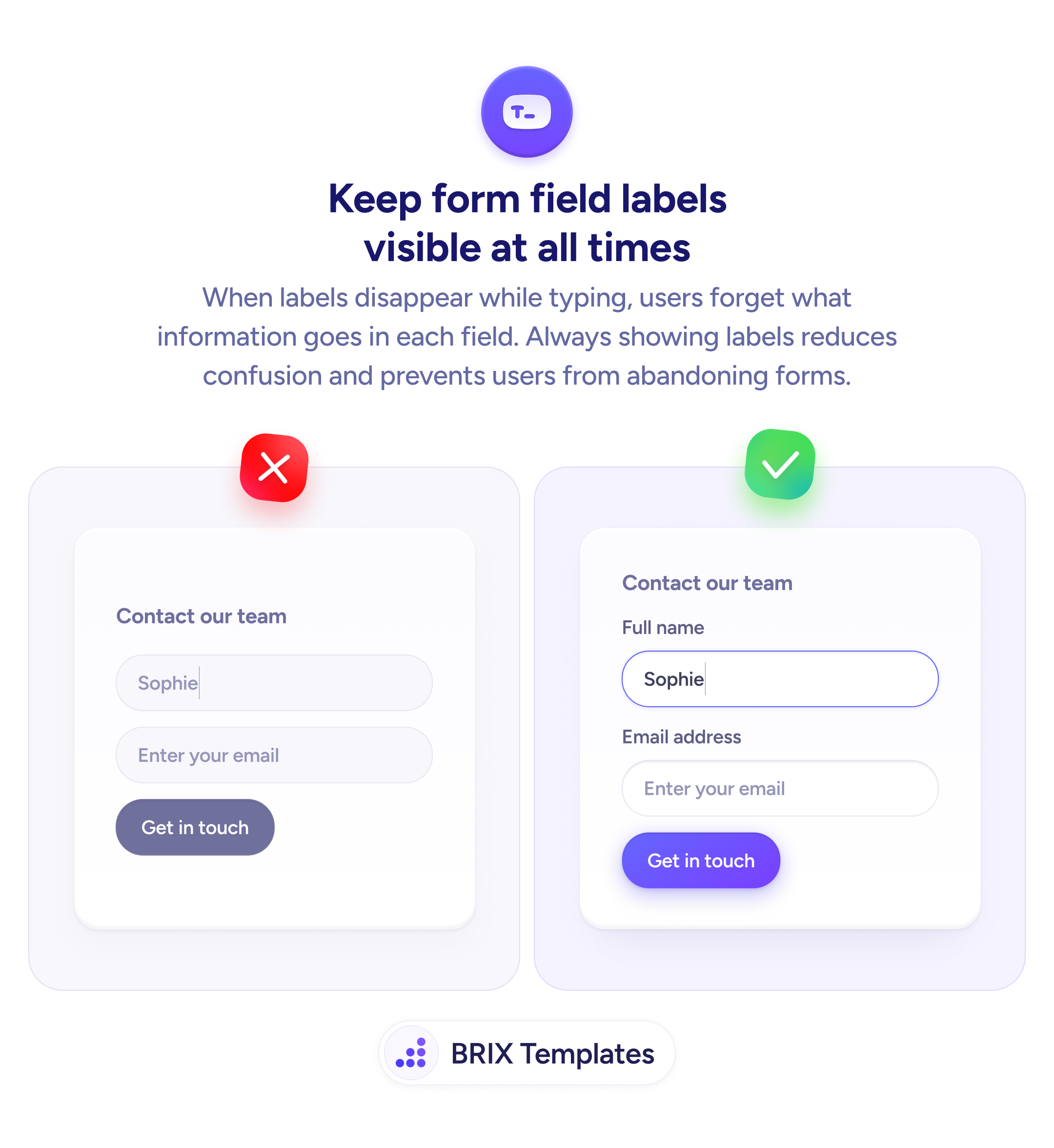
Forms & inputs
Labels that disappear when users type leave them guessing in the middle of a form
Placeholder-only fields lose their label the moment a user types. Persistent labels above each input keep context visible throughout.
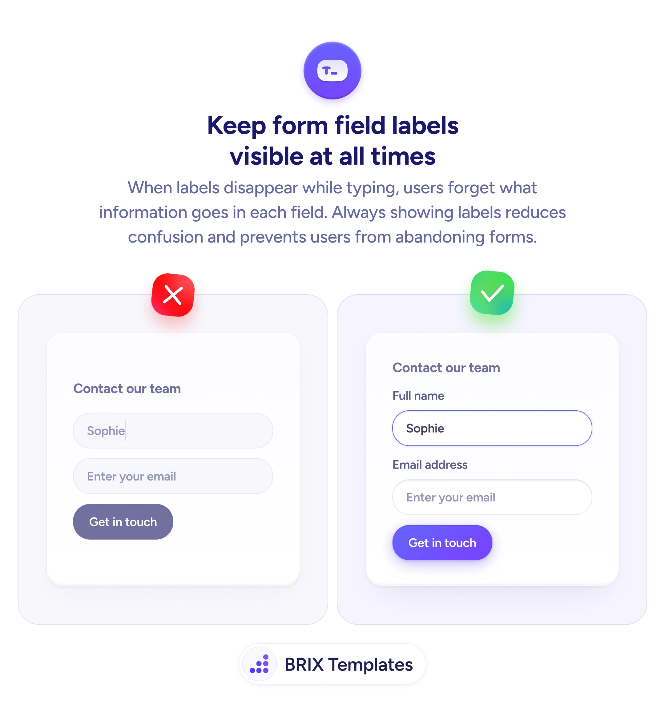
Forms & inputs
Labels that disappear when users type leave them guessing in the middle of a form
Placeholder-only fields lose their label the moment a user types. Persistent labels above each input keep context visible throughout.
When a form relies on placeholder text as the only label, users lose that information the moment they start typing. On a short form this is manageable; on a multi-field form — or for users who have to correct an entry — it becomes genuinely confusing. The field becomes a blank box with no memory of what was asked.
The fix is straightforward: use persistent labels positioned above each input. Above-field labels remain visible regardless of whether the field is empty, focused, or filled. Users can always glance up, confirm what the field requires, and continue without losing their place.
When designing a form, treat the label as part of the field, not a temporary hint. This is especially important for fields like “Company name” or “Job title” that users may misread or leave blank — a visible label gives them the context to fill it correctly. If a field uses a placeholder for an example value (like a sample email format), add a proper label above and keep the placeholder as a secondary cue.
Persistent labels can reduce the time users spend re-reading or questioning what a field needs. They’re especially helpful for users who pause mid-form, make corrections, or have lower familiarity with the product.
Placeholder text should complement labels, not replace them. Once a user starts typing, placeholders disappear, leaving no indication of what the field requires. Always pair a visible label above the field with placeholder text used only for hints like example formats.
Place labels directly above the input they describe, left-aligned with the field. This position is most predictable across screen sizes and assistive technologies. Avoid inline labels inside the field or side labels on narrow viewports.
Yes. Labels should be visible at all times — empty, focused, and filled. This lets users review their entries without losing context about what each field was asking.
Keep the label directly above the input with minimal vertical spacing (8–12px). Use a font weight slightly lighter than the input text but heavier than body copy. Make the label–input pair feel like a single unit.