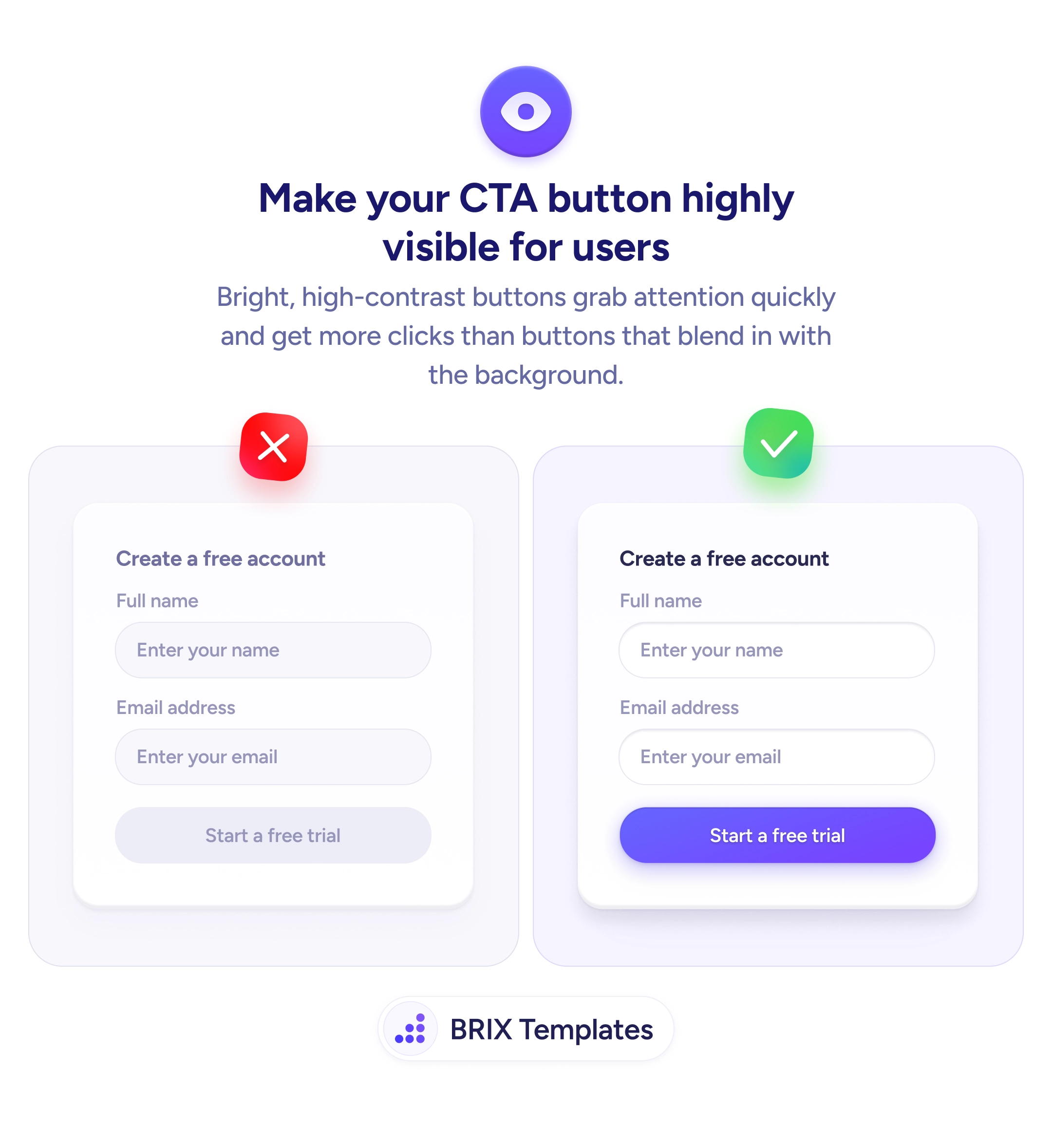
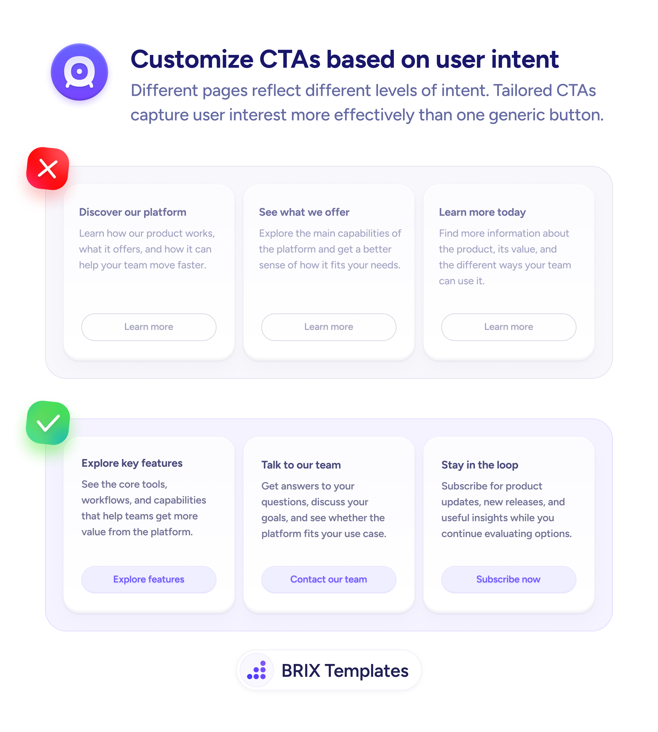
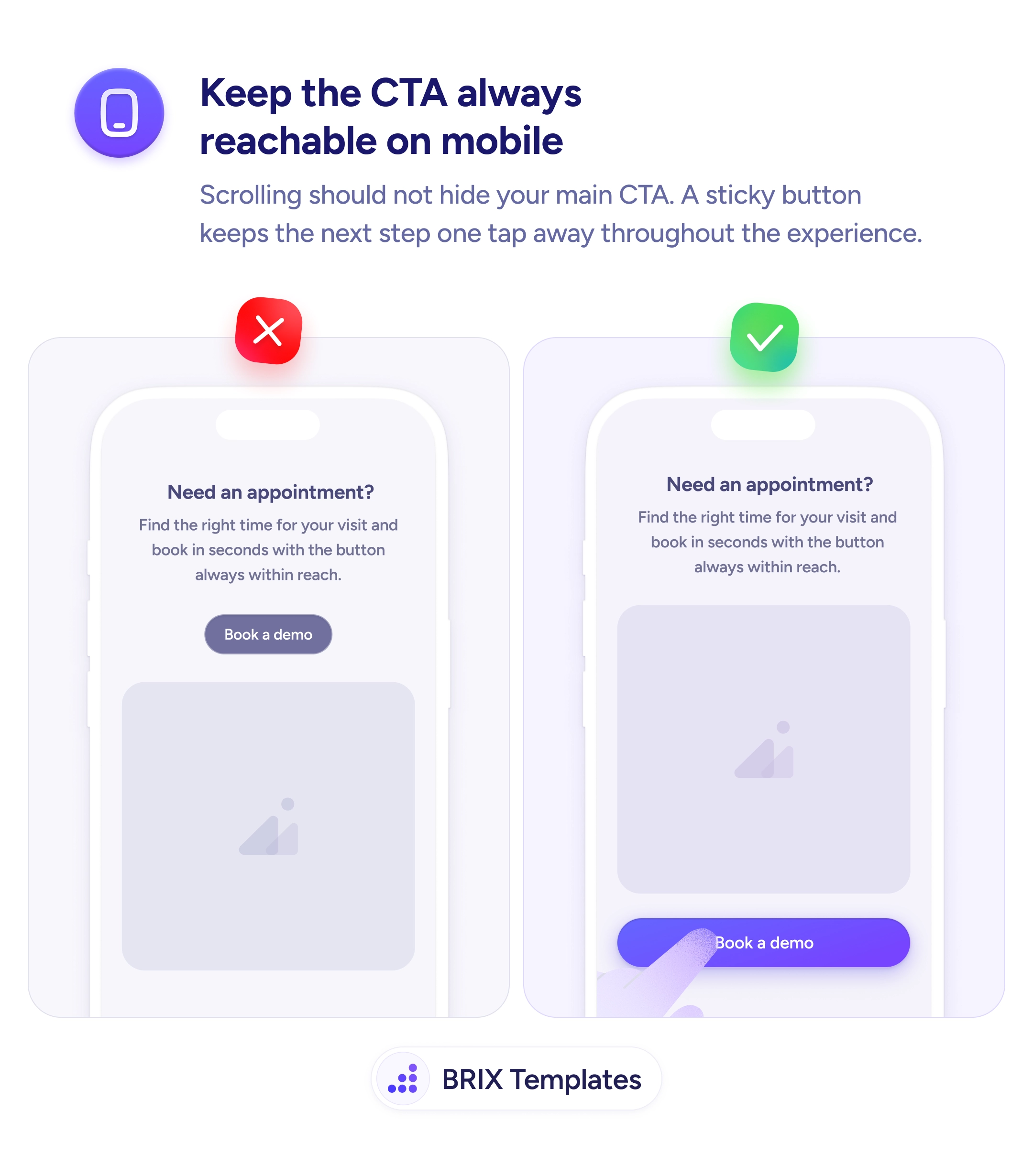
Actions & CTAs
Scrolling shouldn't make your primary action disappear
A sticky CTA button fixed to the bottom of the screen keeps your primary action reachable at every scroll position — reducing friction at the moment of intent.
Actions & CTAs
Scrolling shouldn't make your primary action disappear
A sticky CTA button fixed to the bottom of the screen keeps your primary action reachable at every scroll position — reducing friction at the moment of intent.
When a primary call to action sits inside the page flow, it scrolls away as the user reads. By the time someone finishes a pricing table or a feature list — the moment they’re most ready to act — the button is gone. They’d have to scroll back up to find it, which many users simply don’t do.
A more reliable pattern is to pin the CTA to the bottom of the mobile viewport using a sticky bottom bar. This keeps the action permanently visible regardless of scroll position, so users can convert at any point in their reading journey — not just at the top.
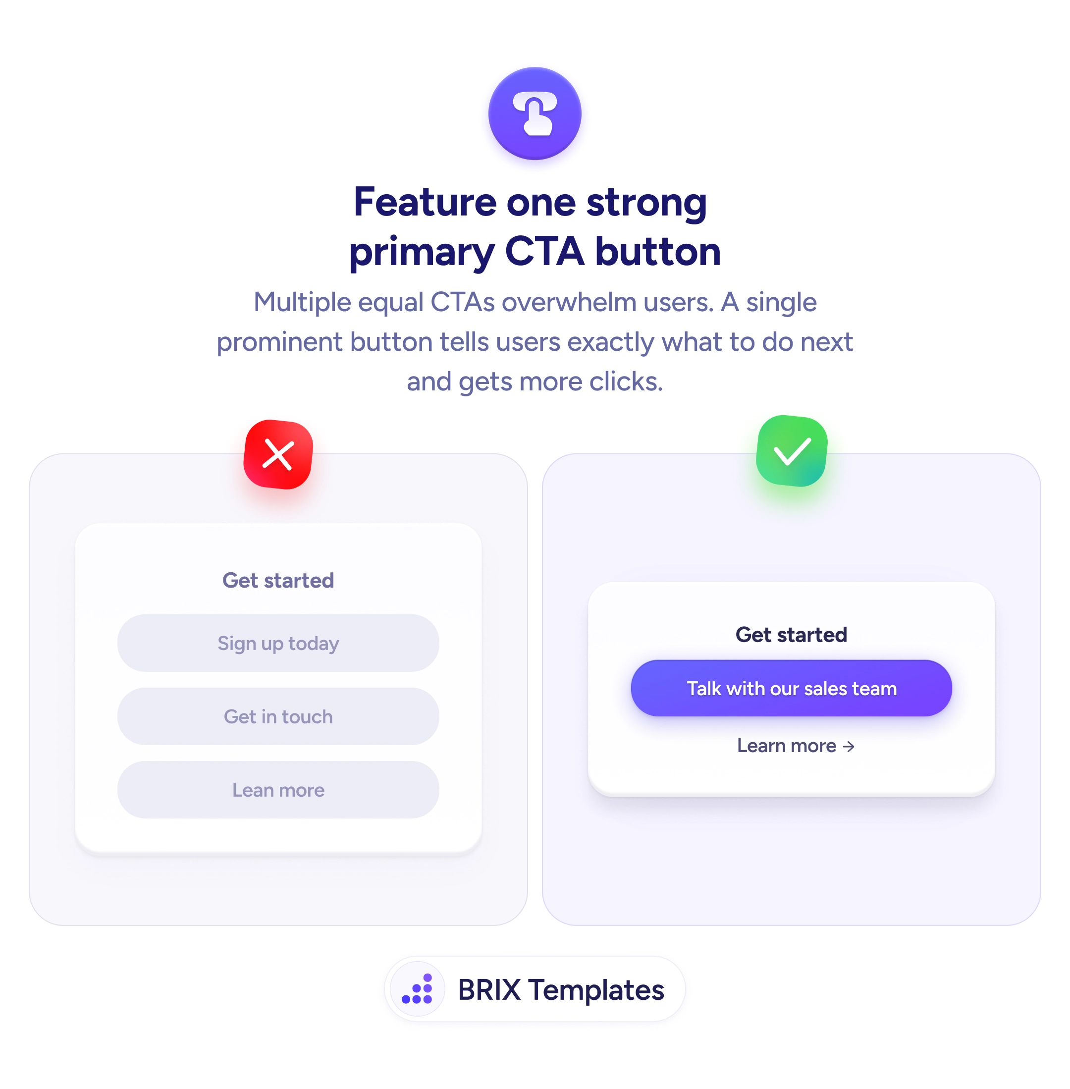
Decide what the single primary action is for that page, then treat it as persistent UI, not page content. Keep the bar minimal: one clear button, enough padding for thumb taps, and enough contrast to be immediately recognizable. Avoid adding multiple buttons to the bar — visual competition defeats the purpose of always-visible placement.
Keeping the conversion action permanently within thumb’s reach can reduce the friction between intent and action. Users who engage with long content often don’t scroll back — a sticky CTA typically captures decisions that a scrolling button would miss.
Test on a real device, not just a browser resize. Check that the bar doesn't cover system navigation on Android, doesn't conflict with Safari's bottom toolbar on iOS, and that all page content remains accessible when scrolled fully down.
Run an A/B test comparing a sticky bottom bar against the same CTA in a fixed page position. Measure tap rate and overall conversion rate. If traffic is limited, a session recording tool can show where users tap.
Reduce visual weight: use a clean background, a single button, and generous white space. If it still feels intrusive, test fading it in after the user scrolls past the first viewport.
This is optional but can improve experience on pages with a footer CTA. Detect when the user scrolls close to the in-page CTA and temporarily hide the sticky bar to avoid showing two identical actions at once.